
Introduction
Responsive Web Design Framework or RWD Frameworks can be helpful in the development of websites that would be operable on any size of the screen through the help of CSS frameworks. This is especially beneficial for two reasons:
- Faster Development: In general, construction of the responsive layouts from the ground could be quite a time-consuming process. Frameworks have components and a grid system that comes with the feature set as either fluid or fixed when it comes to responsive design. This makes the code shorter, so you need to write less, and can concentrate on the genuinely distinctive features of your site.
- Ensured Compatibility: It is tiring to test the responsiveness in different devices. Frameworks remove the element of guesswork by being able to call upon and incorporate media queries, and layouts that are flexible. This creates an efficient way through which your website would be compatible with a desktop, tablet, and a mobile phone without having to write a lot of code manually.
In essence, CSS frameworks act as a shortcut, saving you time and effort while guaranteeing a responsive design for your website.
Bootstrap
It was developed by Twitter in 2011, Bootstrap has empowered millions of websites across the web. Its immense popularity is evident with over 131,000 stars on GitHub, a sign of its widespread adoption by developers.
Why Bootstrap ?
Just like other effective front-end frameworks, Bootstrap combines the power of HTML, CSS, and JavaScript. This makes it a one-stop shop for crafting responsive websites that adapt seamlessly to any screen size, from desktops to mobile phones. Regular updates ensure you’re always working with the latest features and best practices.
Benefits of using Bootstrap:
- Faster Development: Bootstrap provides pre-built components and a grid system specifically designed for responsive design. This translates to less code for you to write, saving you valuable time to focus on the unique aspects of your website.
- Effortless Responsiveness: No need to spend hours testing across different devices. Bootstrap uses media queries and flexible layouts to automatically adjust your website’s look and feel for optimal viewing on any device.
- Extensive Documentation: Bootstrap boasts a wealth of resources to guide you through every step of the learning process.
- Great for Beginners: The user-friendly nature of Bootstrap makes it an ideal starting point for those new to web development.
Keep in Mind:
- Potential for Code Clutter: Extensive use of Bootstrap classes and DOM elements can sometimes lead to a cluttered code-base if not managed properly.
- File Size: The default Bootstrap package includes a variety of styles, some of which you might not use. This can increase the overall file size. However, you can customize Bootstrap to include only the styles you need.
Ready to See It in Action?
Now that you’re familiar with the power of Bootstrap, let’s jump into a live demonstration to see how it works in practice!

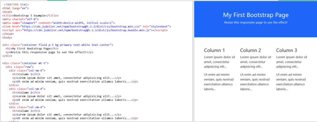
Here changing the width of the viewport also adjusts the elements accordingly..
Conclusion
Website responsiveness is, therefore, very important, and that’s why frameworks are vital when designing a website. They test the compatibility, and take less time that is required to develop new systems from scratch, as well as they give a similar experience to the users. Bootstrap is used as a set of predefined templates, and different components are already designed and can be quickly integrated into the project, and the layout is very customizable, but be prepared to wade through a lot of code and large file sizes. Such difficulties can be mitigated by adapting the frameworks to users’ needs. All in all, these tools facilitate fast and effective web development providing emblematic features and a highly variable and professional look.
Frequently Asked Questions
A CSS framework is a pre-prepared library that contains standardized code snippets and components to help streamline the process of designing and styling a website. By using a CSS framework, developers can save time and effort by leveraging pre-built solutions for common design elements such as grids, buttons, forms, and navigation menus.
CSS frameworks are beneficial for a wide range of projects, from simple landing pages to complex web applications. However, they may not always be the best choice for highly customized or unique designs that require a distinct visual identity. In such cases, developers may opt for a more lightweight solution or rely on custom CSS to achieve the desired look and feel.
While CSS frameworks offer numerous benefits in terms of productivity and consistency, they can also add to the overall file size of a website. This can potentially impact performance, especially on slower connections or older devices. However, many CSS frameworks provide options for customization and optimization to mitigate this issue, allowing developers to include only the necessary components and styles.
