Introduction
In CSS Grid Layout, the grid container is an HTML element that serves as the parent container for grid items. It’s the element where you define the layout grid by specifying the rows and columns, as well as their sizes and alignments.
To designate an element as a grid container, you use the display property in CSS and set it to grid or inline-grid. This property transforms the element into it, allowing you to create a grid-based layout within it.
Once an element becomes a grid container, you can use various its properties to define the structure and behavior of the grid, such as grid-template-columns, grid-template-rows, grid-gap, justify-items, and align-items.

The grid-template-columns property defines the number of columns in your grid layout, and it can define the width of each column.
.grid-container {
  display: grid;
  grid-template-columns: auto auto auto auto;
  gap: 10px;
  background-color: #2196F3;
  padding: 10px;
}output

grid-template-columns property can also be used to specify the size (width) of the columns.
.grid-container {
  display: grid;
  grid-template-columns: 80px 200px auto 40px;
}grid-template-rows property defines the height of each row.
.grid-container {
  display: grid;
  grid-template-rows: 80px 200px;
}justify-content Property :
The justify-content property is used to align the whole grid inside the container.
.grid-container {
  display: grid;
  justify-content: space-evenly;
  grid-template-columns: 70px 70px 70px;
  gap: 10px;
  background-color: #2196F3; /*space-around , center , start , end */
  padding: 10px;
}output

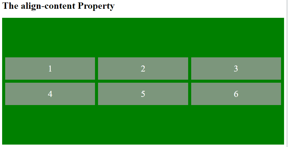
align-content Property
The align-content property is used to vertically align the whole grid inside the container.
.grid-container {
  display: grid;
  height: 400px;
  align-content: center;/*space-around , spaace-evenly, space-between, start , end */
  grid-template-columns: auto auto auto;
  gap: 10px;
  background-color: green;
  padding: 10px;
}output

Conclusions
In conclusion, the CSS Grid Container is a fundamental component of CSS Grid Layout, providing the structure for organizing content into a grid-based layout. By designating an element as it ,developers can define the layout grid and control the positioning and alignment of grid items within it.
With CSS Grid Layout, developers have a powerful tool for creating responsive and visually appealing layouts that adapt to different screen sizes and devices. The flexibility and versatility of CSS Grid Container enable the creation of complex grid structures, allowing for creative and innovative web designs.
By understanding how to use it’s properties and techniques, developers can leverage it to build sophisticated layouts that meet the needs of modern web applications and user interfaces. With its widespread browser support and powerful features, CSS Grid Layout has become an essential tool for web developers seeking to create dynamic and engaging websites.
Frequently Asked Questions
Yes, you can nest grid containers within each other to create more complex layouts. This allows for greater flexibility in organizing content, with each nested grid container defining its own grid structure independent of its parent.
By default, it will expand to accommodate its content. However, you can control how overflowing content is handled using properties like overflow and overflow-x/overflow-y. These properties allow you to specify whether content should be clipped, scrolled, or hidden when it exceeds the dimensions of the grid container.
Yes, CSS Grid Layout can be used alongside other layout methods like Flexbox to create hybrid layouts. This allows you to leverage the strengths of each layout method to achieve more complex designs and handle different layout scenarios effectively.

