
FlexBox in CSS serves as a layout model, offering an efficient approach to designing and organizing items within a container. By facilitating the creation of responsive and flexible web layouts, it streamlines the process significantly. Through its introduction of properties, It grants control over alignment, distribution, and ordering of elements within a container, whether along a single axis (horizontally or vertically) or both axes concurrently.
Features of FlexBox
- Flex Container: To use Flexbox, you designate a container element as a flex container by applying
display: flexordisplay: inline-flexto it. This establishes a new flex formatting context for its children. - Flex Items: The children of a flex container are referred to as flex items. These items can be laid out along the main axis (horizontal by default) and the cross axis (perpendicular to the main axis) based on various properties.
- Main Axis and Cross Axis: Flexbox layouts are defined by a main axis and a cross axis. The main axis is the primary axis along which flex items are laid out, and it’s determined by the
flex-directionproperty. The cross axis is perpendicular to the main axis. - Flex Direction: The
flex-directionproperty defines the direction in which flex items are placed within the flex container. It can be set torow(default),row-reverse,column, orcolumn-reverseto change the layout orientation. - Justify Content: This property controls how flex items are aligned along the main axis of the flex container. It determines the distribution of space between and around flex items. Values include
flex-start,flex-end,center,space-between,space-around, andspace-evenly. - Align Items and Align Content: These properties control the alignment of flex items along the cross axis of the flex container
align-itemsaligns items individually, whilealign-contentaligns the entire line of items within the container. Values includeflex-start,flex-end,center,baseline, andstretch. - Flex Grow, Flex Shrink, and Flex Basis: These properties control how flex items grow, shrink, and their initial size.
flex-growdetermines the ability of a flex item to grow relative to the other flex items in the container.flex-shrinkdetermines the ability of a flex item to shrink if necessary.flex-basisdefines the initial size of a flex item before remaining space is distributed.
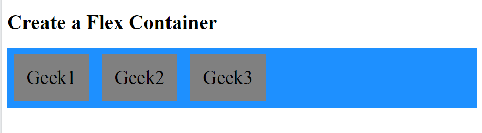
Example 1 of Flexbox
.container {
  display: flex;
  background-color: DodgerBlue;
}

.container > div {
  background-color: gray;
  margin: 10px;
  padding: 20px;
  font-size: 30px;
}output
The flex-direction property defines in which direction the container wants to stack the flex items. The column-reverse value stacks the flex items vertically (but from bottom to top):
row value stacks the flex items horizontally (from left to right)
The row-reverse value stacks the flex items horizontally (but from right to left):
Example 2 of Flexbox
.container {
  display: flex;
  flex-wrap: wrap;
}The flex-wrap property specifies whether the flex items should wrap or not.
.container {
  display: flex;
  flex-wrap: wrap;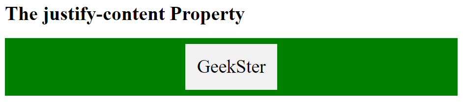
}The justify-content property of Flexbox is used to align the flex items:
The space-around value displays the flex items with space before, between, and after the lines:
.container {
  display: flex;
  justify-content: center; /*space-around */
}Output
The align-items property is used to align the flex items
The baseline value aligns the flex items such as their baselines aligns:
.container {
  display: flex;
  height: 400px;
  align-items: center;
}The flex-grow Property of Flexbox
The flex-grow property specifies how much a flex item will grow relative to the rest of the flex items.
<!DOCTYPE html>
<html>
<head>
<style>
.container {
  display: flex;
  align-items: stretch;
  background-color: green;
}

.container > div {
  background-color: gray;
  color: white;
  margin: 10px;
  text-align: center;
  line-height: 75px;
  font-size: 30px;
}
</style>
</head>
<body>

<h1>The flex-grow Property</h1>

<p>Make the third flex item grow eight times faster than the other flex items:</p>

<div class="container">
  <div style="flex-grow: 1">Geek 1</div>
  <div style="flex-grow: 1">Geek 2</div>
  <div style="flex-grow: 8">Geek 3</div>
</div>

</body>
</html>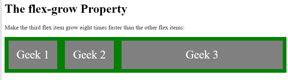
The flex-shrink Property of Flexbox
The flex-shrink property specifies how much a flex item will shrink relative to the rest of the flex items.
<div style="flex-shrink: 2">3</div>The flex-basis Property
The flex-basis property specifies the initial length of a flex item.
Conclusion
CSS Flexbox represents a paradigm shift in layout design for web development, revolutionizing traditional approaches. Its intuitive and potent features empower developers to craft responsive and dynamic layouts with remarkable ease. Here are some key takeaways::
- Flexible Layouts: Flexbox provides a flexible and dynamic layout model that adapts to different screen sizes and orientations, making it easier to create responsive designs.
- Simplified Alignment: With properties like
justify-contentandalign-items, Flexbox simplifies the task of aligning elements both horizontally and vertically, eliminating the need for complex CSS hacks. - Ordering and Reordering: Flexbox not only allows you to control the order of flex items using the order property but also enables you to rearrange elements visually without altering the HTML structure. Consequently, this provides greater flexibility and ease in managing the layout and design of your web pages.
- Versatility: Flexbox can be used for a wide range of layout scenarios, from simple navigation menus to complex grid systems, offering developers a versatile tool for building modern web interfaces.
- Browser Support: While Flexbox enjoys broad support across modern browsers, it’s essential to test your layouts in different browsers and versions to ensure compatibility, especially if you need to support older browsers.
In conclusion, CSS Flexbox equips developers with the tools to fashion layouts that are not just flexible and responsive, but also visually captivating, thus enriching the user experience on the web. Through adept mastery of Flexbox, developers can efficiently streamline their workflow, culminating in websites that seamlessly adapt to the myriad array of devices and screen sizes
Frequently Asked Questions
Flexbox, short for Flexible Box Layout, is a CSS layout module that provides a more efficient way to design, align, and distribute space among items in a container, even when their size is unknown or dynamic.
Flexbox offers a simpler and more powerful way to create layouts compared to traditional CSS methods. It allows you to achieve complex layouts with less code, enables easier alignment and distribution of elements, and provides better responsiveness.
While both Flexbox and CSS Grid are CSS layout modules, they serve different purposes. Flexbox is primarily designed for one-dimensional layouts, such as arranging items in a row or column, whereas CSS Grid is better suited for two-dimensional layouts with rows and columns.
