
Introduction
CSS Website Layout or the Cascading Style Sheets is one of the core technologies applied in a website development that determines the location, look, and feel and general presentation of the elements within the web page. CSS web layout defines the position and positioning of different components within a given webpage and they include the headings, menus, content areas, columns, sections and footer areas.
Key points about CSS website layout:
Box Model
The CSS box model is one of the main structure models used in designing websites. It describes how items are displayed on a webpage by taking into account what is inside an element, space between an element and its border, and the border space/to space around an element. It is necessary to comprehend the box model in an effort to regulate the positions and proportions of objects.
/* Example of the CSS box model */
.box {
  width: 200px;
  padding: 20px;
  border: 1px solid #ccc;
  margin: 10px;
}Positioning
CSS offers a set of positioning options to help to position various elements in the layout of the Web page. These are the static, relative, absolute position and fixed static, position for relative position it is position relative to its normal position, for absolute position it is a position relative to nearest position ancestor, and for fixed position it is position relative to the viewport.
/* Example of CSS positioning */
.relative {
  position: relative;
  top: 10px;
  left: 20px;
}

.absolute {
  position: absolute;
  top: 50px;
  right: 0;
}

.fixed {
  position: fixed;
  bottom: 0;
  left: 0;
}Flexbox and Grid Layout
CSS provides enhanced layout solutions like; Flexbox, CSS Grid Layout which afford unique solutions for enhanced responsive designs of web sites. Flexbox helps layout elements either along the horizontal or the vertical direction or in both directions at the same time as a continuum; whereas CSS Grid Layout can be used for designing several rows and columns of boxes simultaneously.
Flexbox :
/* Example of Flexbox layout */
.container {
  display: flex;
  justify-content: space-between;
}

.item {
  flex: 1;
  margin: 10px;
}Grid Layout :
/* Example of CSS Grid layout */
.grid-container {
  display: grid;
  grid-template-columns: 1fr 2fr;
  gap: 10px;
}

.grid-item {
  padding: 10px;
  border: 1px solid #ccc;
}Responsive Design
Here, the concept of ‘liquid’ layout or ‘-responsive’ design appears to be one of the most important characteristics of the modern Web page layout based on the ability to adapt to different screen sizes and the presence of various devices. Responsive designs that offer good readability and usability on all the major web devices such as desktop, tablet, and mobile are developed through the use of media inquiries, setting viewport, and fluid grids.
/* Example of Media Queries for responsiveness */
@media screen and (max-width: 768px) {
  .container {
    flex-direction: column;
  }
}Semantic HTML and Accessibility
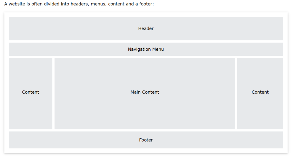
An appropriate semantic HTML structure facilitates a proper construction of the meaning behind the content of a webpage. Proper HTML elements, such as headers, navigation, main, section, sidebar, and footer, therefore creates a proper accessibility for all web users.
<!-- Example of Semantic HTML -->
<header>
  <nav>
    <ul>
      <li><a href="#">Home</a></li>
      <li><a href="#">About</a></li>
      <li><a href="#">Contact</a></li>
    </ul>
  </nav>
</header>

<main>
  <section>
    <h1>Main Content Section</h1>
    <p>This is the main content of the webpage.</p>
  </section>

  <aside>
    <h2>Sidebar Section</h2>
    <p>Additional information or links can go here.</p>
  </aside>
</main>

<footer>
  <p>© 2024 Example Website. All rights reserved.</p>
</footer>Conclusion
CSS Website Layouts is one of the most vital pages on the theme of web development. It enables the developer to effectively design a website or webpage for users to be visually appealing, user-friendly, and accessible. Using responsive CSS layout techniques and best practices, a developer can write responsive and flexible layouts that adapt to various devices and different screen sizes. Success in web projects is achieved through proper attention paid to accessibility and performance while increasing the intuitive and engaging experience in browsing offered to users through CSS website layouts.
Frequently Asked Questions
CSS website layout refers to the arrangement and organization of elements on a webpage using Cascading Style Sheets. It is crucial as it determines the visual structure and presentation of content, impacting usability, accessibility, and overall user experience.
2. What are the common CSS layout techniques used in web development?
Common CSS layout techniques include using floats, positioning, Flexbox, and CSS Grid Layout. These techniques enable developers to create responsive, flexible, and visually appealing website layouts that adapt to different screen sizes and devices.
3. How can I create a responsive website layout with CSS?
To create a responsive website layout, you can utilize CSS media queries to adjust styles based on the viewport size. Additionally, CSS frameworks like Bootstrap or Foundation provide pre-designed grid systems and responsive utilities to streamline the process of building responsive layouts.
