Introduction
CSS offers various properties and techniques to apply visually appealing effects to text elements, enhancing their appearance and readability.
Key Points About Text Effects
- Text Shadows:
- CSS
text-shadowproperty adds shadows behind text characters, improving readability and adding visual interest. It accepts values for horizontal and vertical offsets, blur radius, and color, allowing developers to create shadow effects for text.
- CSS
- Text Overflow:
- CSS
text-overflowproperty controls how text content that overflows its containing element is displayed. Common values includeellipsis, which truncates overflowing text and adds an ellipsis (…) to indicate hidden content.
- CSS
- Text Decoration:
- CSS
text-decorationproperty adds decorative effects to text, such as underlines, overlines, and line-throughs. You can use it to enhance links, indicate emphasis, or denote strikethrough text.
- CSS
- Text Transform:
- CSS
text-transformproperty modifies the capitalization of text characters, converting them to uppercase, lowercase, or capitalize the first letter of each word. This property is useful for styling headings, labels, and navigation menus.
- CSS
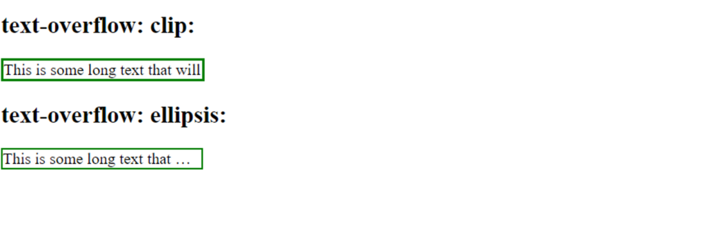
Text Overflow
The CSS text-overflow property specifies how overflowed content that is not displayed should be signaled to the user
p.ev1 {
  white-space: nowrap;
  width: 200px;
  border: 3px solid green;
  overflow: hidden;
  text-overflow: clip;
}

p.ev2 {
  white-space: nowrap;
  width: 200px;
  border: 2px solid green;
  overflow: hidden;
  text-overflow: ellipsis;
}output:-
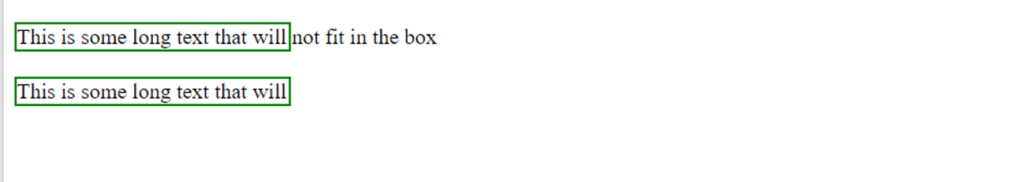
you can display the overflowed content when hovering over the element:
div.ev:hover {
  overflow: visible;
}output
Text Shadows
Text shadows in CSS allow you to add depth and dimension to your text by casting shadows behind it. This effect can be subtle or dramatic, depending on the settings you choose. Here’s how to use the text-shadow property in CSS:
Syntax
selector {
  text-shadow: h-shadow v-shadow blur-radius color;
}- h-shadow: Required. The horizontal shadow. Positive values move the shadow to the right, negative values to the left.
- v-shadow: Required. The vertical shadow. Positive values move the shadow down, negative values up.
- blur-radius: Optional. The blur distance. The higher the value, the more blurred the shadow will be. Default is 0 (sharp shadow).
- color: Optional. The color of the shadow. If omitted, the browser uses the color of the text.
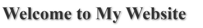
Examples:-
h1 {
  font-size: 48px;
  color: #333; /* Text color */
  text-shadow: 2px 2px 4px rgba(0, 0, 0, 0.5); /* Shadow offset, blur radius, and color */
}Output:-
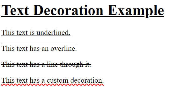
Text Decoration
The text-decoration property in CSS is used to set the decoration of text, such as underlines, overlines, line-throughs (strikethroughs), and their colors and styles. This property can be applied to text elements to enhance their appearance and provide additional context (e.g., hyperlinks, marked text).
Syntax
selector {
  text-decoration: value;
}Values
none: Removes any decoration from the text.underline: Adds an underline to the text.overline: Adds a line above the text.line-through: Adds a line through the middle of the text (strikethrough).underline overline: Adds both an underline and an overline to the text.
Example:-
h1 {
  text-decoration: underline;
}

.underline {
  text-decoration: underline;
}

.overline {
  text-decoration: overline;
}

.line-through {
  text-decoration: line-through;
}

.custom-decoration {
  text-decoration: underline wavy red;
}
Output:-
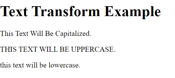
Text Transform
The text-transform property in CSS is used to control the capitalization of text. This property can transform text to uppercase, lowercase, or capitalize each word, among other transformations. It’s commonly used to standardize the appearance of text regardless of how it was originally written in the HTML.
Syntax
selector {
  text-transform: value;
}Values
none: No transformation (default).capitalize: Transforms the first character of each word to uppercase.uppercase: Transforms all characters to uppercase.lowercase: Transforms all characters to lowercase.full-width: Transforms characters into their full-width form (mostly used in East Asian typography).
Example:-
h1 {
  text-transform: none;
}

.capitalize {
  text-transform: capitalize;
}

.uppercase {
  text-transform: uppercase;
}

.lowercase {
  text-transform: lowercase;
}Output:-
Conclusion
CSS text effects offer a versatile way to enhance the appearance and style of text elements in web design. By applying properties like text-shadow, text-overflow, text-decoration, text-transform, and letter-spacing, developers can create visually appealing and engaging text experiences that improve readability and aesthetic appeal. While text effects can enhance the visual design of a website, it’s crucial to use them judiciously and consider their impact on accessibility, usability, and SEO. With careful styling and consideration, it can elevate the overall design and user experience of web interfaces.
Frequently Asked Question
Yes, you can apply multiple text effects to the same text element in CSS by combining different text properties such as text-shadow, text-decoration, text-transform, etc. This allows for creative and customized styling of text elements.
To create responsive text effects, developers can use relative units like percentages or viewport units (vw, vh) for sizing text and spacing. Furthermore, you can utilize media queries to adapt text effects according to screen size or device orientation.
While CSS text effects can enhance the visual appeal of text, it’s essential to ensure they do not compromise accessibility or SEO. Use text effects judiciously, prioritizing readability and usability.. For example, decorative text effects like shadows and transformations should not hinder text legibility or screen reader compatibility.
