Introduction
CSS allows developers to style and enhance images on web pages, providing flexibility in design and presentation.
Key Point’s on CSS Style Images
- Image Borders:
- CSS enables the addition of borders to images using the
borderproperty. Developers can specify the border width, style, and color to create custom borders around images.
- CSS enables the addition of borders to images using the
- Image Size:
- CSS provides properties like
widthandheightto control the size of images. By setting these properties, developers can adjust the dimensions of images to fit specific layout requirements.
- CSS provides properties like
- Image Alignment:
- Images can be aligned horizontally and vertically within their containing elements using CSS properties like
float,text-align,vertical-align, andmargin. These properties allow developers to position images precisely within a layout.
- Images can be aligned horizontally and vertically within their containing elements using CSS properties like
- Image Opacity and Transparency:
- CSS offers the
opacityproperty to adjust the transparency of images. By setting the opacity value, developers can control the level of transparency for images, allowing for creative visual effects.
- CSS offers the
- Image Filters and Effects:
- CSS supports various filter effects, such as grayscale, blur, brightness, contrast, and saturation, which can be applied to images using the
filterproperty. Additionally, CSSbox-shadowandborder-radiusproperties can be used to add shadow and rounded corners to images.
- CSS supports various filter effects, such as grayscale, blur, brightness, contrast, and saturation, which can be applied to images using the
- Image Sprites:
- CSS image sprites are a technique where multiple images are combined into a single image file. By using CSS background positioning, developers can display specific parts of the image sprite as background images for elements, reducing server requests and improving performance.
- Responsive Images:
- CSS allows developers to create responsive images that adapt to different screen sizes and devices. Techniques like using the
max-widthproperty or CSS media queries can be employed to ensure images scale appropriately on various devices.
- CSS allows developers to create responsive images that adapt to different screen sizes and devices. Techniques like using the
Thumbnail Images in CSS Style Images
Use the border property to create thumbnail images.
img {
  border: 2px solid #ddd;
  border-radius: 5px;
  padding: 5px;
  width: 200px;
}

img:hover {
  box-shadow: 0 0 2px 2px rgba(0, 140, 186, 0.5);
}Output

Responsive Images in CSS Style Images
Responsive images will automatically adjust to fit the size of the screen.
img {
  max-width: 100%;
  height: auto;
} Center an Image in CSS Style Images
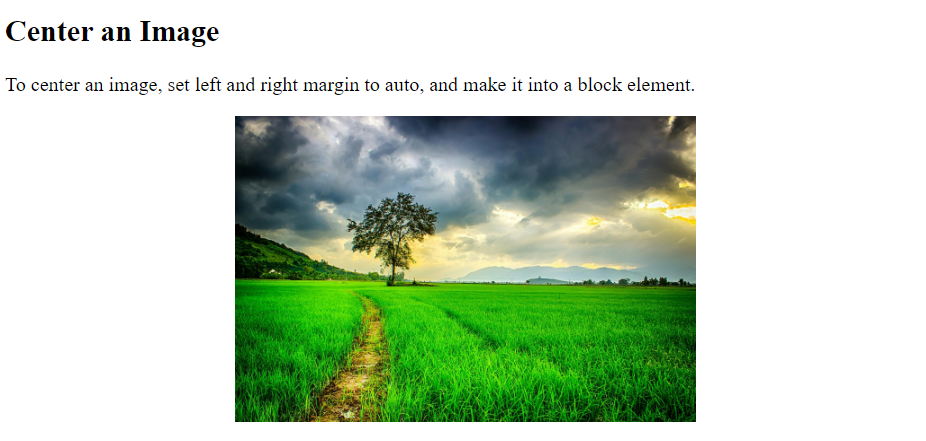
To center an image, set left and right margin to auto and make it into a block element:
img {
  display: block;
  margin-left: auto;
  margin-right: auto;
  width: 50%;
}Output
Images / Cards in CSS Style Images
body {margin:25px;}

div.green {
  width: 80%;
  background-color: white;
  box-shadow: 0 4px 8px 0 rgba(0, 0, 0, 0.2), 0 6px 20px 0 rgba(0, 0, 0, 0.19);
  margin-bottom: 25px;
}

div.container {
  text-align: center;
  padding: 10px 20px;
}Output
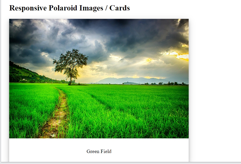
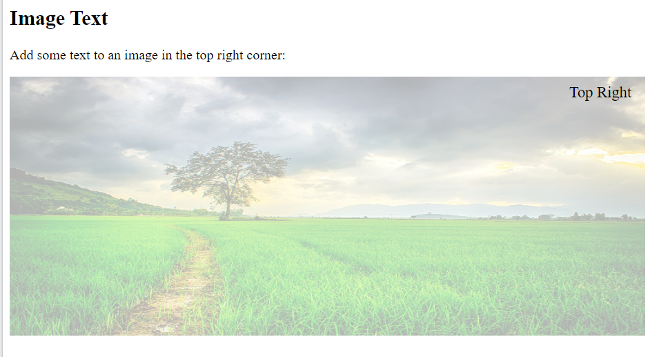
Image Text in CSS Style Images
How to position text in an image:
<!DOCTYPE html>
<html>
<head>
<style>
.container {
  position: relative;
}

.topright {
  position: absolute;
  top: 8px;
  right: 16px;
  font-size: 18px;
}

img {
  width: 100%;
  height: 300px;
  opacity: 0.3;
}
</style>
</head>
<body>

<h2>Image Text</h2>

<p>Add some text to an image in the top right corner:</p>

<div class="container">
  <img src="https://external-content.duckduckgo.com/iu/?u=https%3A%2F%2Fimages.pexels.com%2Fphotos%2F236047%2Fpexels-photo-236047.jpeg%3Fcs%3Dsrgb%26dl%3Dclouds-cloudy-countryside-236047.jpg%26fm%3Djpg&f=1&nofb=1&ipt=e3a3b86365825156e735f95d45bfb35c2873f55b3dd683d861395b20a87aa1c1&ipo=images" alt="Cinque Terre" width="1000" height="300">
  <div class="topright">GeekSter</div>
</div>

</body>
</html>output
Bottom Left in CSS Style Images
.bottomleft {
  position: absolute;
  bottom: 8px;
  left: 16px;
  font-size: 18px;
}Image Filters in CSS Style Images
The CSS filter property adds visual effects (like blur and saturation) to an element.
<!DOCTYPE html>
<html>
<head>
<style>
body {
  background-color:white;
}
img {
  width: 33%;
  height: auto;
  float: left;
  max-width: 235px;
}

.blur {filter: blur(4px);}

</style>
</head>
<body>

<h2>Image Filters</h2>

<p><strong>Note:</strong> The filter property is not supported in Internet Explorer or Edge 12.</p>


<img class="blur" src="https://external-content.duckduckgo.com/iu/?u=https%3A%2F%2Fimages.pexels.com%2Fphotos%2F236047%2Fpexels-photo-236047.jpeg%3Fcs%3Dsrgb%26dl%3Dclouds-cloudy-countryside-236047.jpg%26fm%3Djpg&f=1&nofb=1&ipt=e3a3b86365825156e735f95d45bfb35c2873f55b3dd683d861395b20a87aa1c1&ipo=images" alt="Pineapple" width="300" height="300">

</body>
</html>Output

Image Hover Overlay
Create an overlay effect on hover:
<!DOCTYPE html>
<html>
<head>
<style>
.container {
  position: relative;
  width: 50%;
}

.image {
  display: block;
  width: 100%;
  height: auto;
}

.overlay {
  position: absolute;
  bottom: 100%;
  left: 0;
  right: 0;
  background-color: #008CBA;
  overflow: hidden;
  width: 100%;
  height: 0;
  transition: .5s ease;
}

.container:hover .overlay {
  bottom: 0;
  height: 100%;
}

.text {
  white-space: nowrap;
  color: white;
  font-size: 20px;
  position: absolute;
  overflow: hidden;
  top: 50%;
  left: 50%;
  transform: translate(-50%, -50%);
  -ms-transform: translate(-50%, -50%);
}
</style>
</head>
<body>

<h2>Slide in Overlay from the Top</h2>

<div class="container">
  <img src="https://external-content.duckduckgo.com/iu/?u=https%3A%2F%2Fimages.pexels.com%2Fphotos%2F236047%2Fpexels-photo-236047.jpeg%3Fcs%3Dsrgb%26dl%3Dclouds-cloudy-countryside-236047.jpg%26fm%3Djpg&f=1&nofb=1&ipt=e3a3b86365825156e735f95d45bfb35c2873f55b3dd683d861395b20a87aa1c1&ipo=images" alt="Avatar" class="image">
  <div class="overlay">
    <div class="text">Hello GeekSter</div>
  </div>
</div>

</body>
</html>output

Flip an Image
Move your mouse over the image:
img:hover {
  transform: scaleX(-1);
}Conclusion
Styling images with CSS offers developers a wide range of options to enhance the visual appeal and usability of web pages. By leveraging CSS properties like border, max-width, filter, and alignment properties, developers can customize the appearance and behavior of images to meet specific design requirements. Additionally, ensuring images are responsive, optimized for performance, and accessible to all users contributes to an improved user experience. With careful consideration of CSS styling techniques, developers can create visually compelling and engaging websites that effectively communicate their content to users.
Frequently Asked Questions
Yes, CSS provides the border property that allows you to add borders of different styles, widths, and colors to images. You can customize the border appearance to match your design requirements.
To make images responsive, you can use CSS properties like max-width: 100% to ensure that images scale proportionally within their container while maintaining their aspect ratio. This approach helps images adapt to different screen sizes and devices.
