Introduction
A CSS navbar, short for navigation bar, is a common UI component used in web design to provide navigation links to different sections or pages of a website. It typically appears at the top of a webpage and contains links or buttons that allow users to navigate between different parts of the site.
Here are some key points about CSS navbars:
- Structural Markup:
- Navbars are typically created using HTML
<nav>element along with unordered lists (<ul>) and list items (<li>). Links or buttons are placed inside the list of items to represent navigation items.
- Navbars are typically created using HTML
- Styling with CSS:
- CSS is used to style the navbar’s appearance, including its background color, text color, font, spacing, and layout. CSS properties like
background-color,color,font-family,padding,margin, anddisplayare commonly used to achieve the desired design.
- CSS is used to style the navbar’s appearance, including its background color, text color, font, spacing, and layout. CSS properties like
- Responsive Design:
- Modern CSS navbars are often designed to be responsive, meaning they adapt to different screen sizes and devices. Techniques like media queries, flexbox, or CSS grid are used to create responsive layouts that adjust the navbar’s appearance based on the viewport size.
- Dropdown Menus:
- Navbars may include dropdown menus to accommodate a large number of navigation links or subcategories. CSS is used to style the dropdown menu’s appearance and behavior, such as its position, animation, and visibility.
- Interactive Features:
- CSS can be used to add interactive features to the navbar, such as hover effects, active states, or transitions. These enhancements improve the user experience by providing visual feedback when interacting with navigation items.
CSS Navbar Bar = List of Links
A navigation bar needs standard HTML as a base.
In our examples, we will build the navigation bar from a standard HTML list.
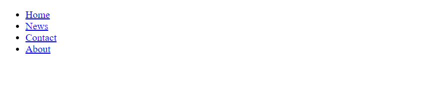
Example 1.
<!DOCTYPE html>
<html>
<body>

<ul>
  <li><a href="#home">Home</a></li>
  <li><a href="#news">News</a></li>
  <li><a href="#contact">Contact</a></li>
  <li><a href="#about">About</a></li>
</ul>
</body>
</html>
Output
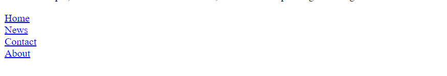
Example 2.
ul {
  list-style-type: none;
  margin: 0;
  padding: 0;
}
Output
Example 3.
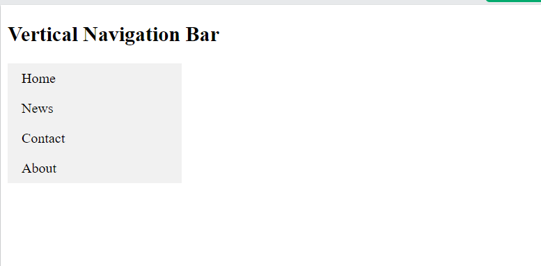
ul {
  list-style-type: none;
  margin: 0;
  padding: 0;
  width: 200px;
  background-color: #f1f1f1;
}

li a {
  display: block;
  color: #000;
  padding: 8px 16px;
  text-decoration: none;
}

/* Change the link color on hover */
li a:hover {
  background-color: #555;
  color: white;
}Output
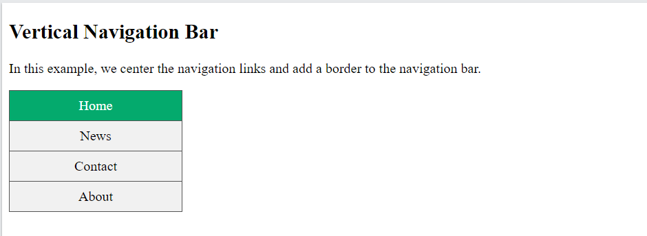
ul {
list-style-type: none;
margin: 0;
padding: 0;
width: 200px;
background-color: #f1f1f1;
border: 1px solid #555;
}
li a {
display: block;
color: #000;
padding: 8px 16px;
text-decoration: none;
}
li {
text-align: center;
border-bottom: 1px solid #555;
}
li:last-child {
border-bottom: none;
}
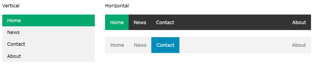
li a.active {
background-color: #04AA6D;
color: white;
}
li a:hover:not(.active) {
background-color: #555;
color: white;
}Output
Horizontal Navigation Bar
There are two ways to create a horizontal navigation bar. Using inline or floating list items.
ul {
  list-style-type: none;
  margin: 0;
  padding: 0;
}

li {
  display: inline;
}Output

Floating List Items
Another way of creating a horizontal navigation bar is to float the <li> elements, and specify a layout for the navigation links:
ul {<br> list-style-type: none;<br> margin: 0;<br> padding: 0;<br> overflow: hidden;<br>}<br><br>li {<br> float: left;<br>}<br><br>li a {<br> display: block;<br> padding: 8px;<br> background-color: #dddddd;<br>}output

Horizontal Navigation Bar Examples
Create a basic horizontal navigation bar with a dark background color and change the background color of the links when the user moves the mouse over them:
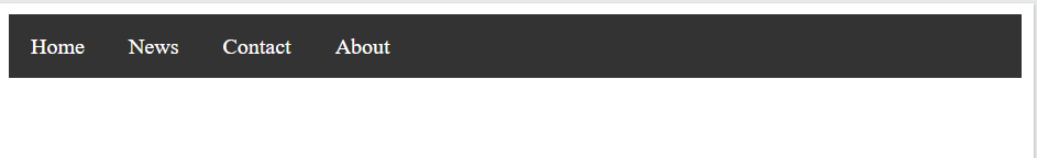
ul {
  list-style-type: none;
  margin: 0;
  padding: 0;
  overflow: hidden;
  background-color: #333;
}

li {
  float: left;
}

li a {
  display: block;
  color: white;
  text-align: center;
  padding: 14px 16px;
  text-decoration: none;
}

li a:hover {
  background-color: #111;
}Output
Conclusion
CSS navbars are fundamental components of web design, providing users with intuitive navigation options to explore different sections or pages of a website. By leveraging HTML markup and CSS styling techniques, designers can create visually appealing and user-friendly navbars that enhance the overall user experience. Whether it’s creating responsive layouts, adding dropdown menus, or ensuring accessibility, CSS navbars play a crucial role in improving website navigation and usability.
Frequently Asked Questions
Ans: Navbars are typically created using HTML elements such as <nav>, <ul>, and <li> for structure, along with CSS for styling. Links or buttons representing navigation items are placed inside list items within the navbar.
Q2. Can a CSS navbar be responsive?
Ans: Yes, modern CSS navbars are often designed to be responsive, meaning they adapt to different screen sizes and devices. Techniques like media queries, flexbox, or CSS grid are used to create responsive layouts for navbars.
Q3. How can I add dropdown menus to a CSS navbar?
Ans: Dropdown menus can be added to a CSS navbar to accommodate a large number of navigation links or subcategories. This is typically achieved using CSS to style the dropdown menu’s appearance and behavior, such as its position and visibility.
Q4. Are there any accessibility considerations for CSS navbars?
Ans: Yes, it’s important to ensure that CSS navbars are accessible to all users, including those using assistive technologies like screen readers. Semantic HTML markup and proper use of ARIA attributes help make navbars more accessible to users with disabilities.
