
Introduction
The CSS width and height properties control the area and its behavior — how it changes depending on the screen size and the content’s dimensions.
The width property defines how wide the element’s content can get. By default, the width property doesn’t include padding, borders, and margins.
Key Points:
Purpose
CSS height and width properties determine the vertical and horizontal dimensions of an element, respectively. They specify the size of an element’s content box, including any padding, border, or margin added to it.
Setting Dimensions
Height and width can be set using various units such as pixels (px), percentages (%), ems (em), rems (rem), or viewport units (vw, vh). These units provide flexibility in sizing elements based on fixed values, percentages relative to parent containers, or viewport dimensions.
Auto Value
The auto value for height and width allows the browser to calculate the size of an element automatically based on its content or context. For example, setting width: auto; on a block-level element will cause it to expand to fill the available horizontal space within its parent container.
Maximum And Minimum Dimensions
CSS also provides properties for setting maximum (max-height, max-width) and minimum (min-height, min-width) dimensions for elements. These properties ensure that elements do not exceed or fall below specified size limits, providing control over responsiveness and layout consistency.
Content Box VS Border Box
The box-sizing property allows designers to specify how the height and width properties should be calculated. By default, dimensions are calculated based on the content box, excluding padding and border. However, setting box-sizing: border-box; includes padding and border in the specified dimensions, simplifying layout calculations.
The height and width properties may have the following values:
auto– This is the default. The browser calculates the height and widthlength– Defines the height/width in px, cm, etc.%– Defines the height/width in percent of the containing blockinitial– Sets the height/width to its default valueinherit– The height/width will be inherited from its parent value
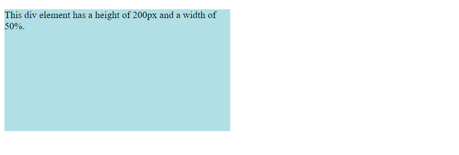
div {
  height: 200px;
  width: 50%;
  background-color: powderblue;
}Output
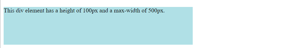
Setting max-width
If you for some reason use both the width property and the max-width property on the same element, and the value of the width property is larger than the max-width property; the max-width property will be used (and the width property will be ignored).
div {
  max-width: 500px;
  height: 100px;
  background-color: powderblue;
}Output
Conclusion
CSS height and width properties are essential tools for defining the size dimensions of HTML elements in web design. By understanding how to set dimensions using different units and values, designers can create responsive layouts that adapt to various screen sizes and devices. Leveraging properties like max-height and max-width ensures layout consistency, while the box-sizing property simplifies dimension calculations. Overall, mastering height and width properties empowers designers to achieve precise control over the appearance and layout of elements on web pages, enhancing the user experience.
Frequently Asked Questions
Yes, you can set the height and width of an element using percentages relative to its parent container’s dimensions. This allows for flexible and responsive layouts that adapt to different screen sizes.
auto value work for height and width? Setting the height or width property to auto allows the browser to automatically calculate the size of an element based on its content or context. For example, an element with width: auto; will expand to fit its content horizontally.
Yes, you can use the max-height and max-width properties to set maximum dimensions for elements. This ensures that elements do not exceed specified size limits, maintaining layout consistency and preventing overflow.
box-sizing property affect height and width calculations? The box-sizing property determines whether the height and width properties include padding and border in their calculations. By default, dimensions are calculated based on the content box. However, setting box-sizing: border-box; includes padding and border, simplifying layout calculations.
