Introduction
CSS (Cascading Style Sheets) is used to enhance the appearance and layout of HTML forms, making them more visually appealing and user-friendly. CSS properties can be applied to various elements within forms, such as input fields, labels, buttons, and form containers, to customize their appearance, alignment, spacing, and behavior. Here are key points about CSS forms:
- Styling Input Fields:
- CSS can be used to style input fields (e.g., text fields, checkboxes, radio buttons, dropdown menus) to match the design of the website. Properties like
border,background-color,padding,font-size, andborder-radiuscan be applied to input elements to customize their appearance.
- CSS can be used to style input fields (e.g., text fields, checkboxes, radio buttons, dropdown menus) to match the design of the website. Properties like
- Customizing Labels:
- Labels associated with form elements can be styled using CSS to improve readability and alignment. Properties like
color,font-weight,text-transform, andmargincan be used to customize label appearance and position relative to input fields.
- Labels associated with form elements can be styled using CSS to improve readability and alignment. Properties like
- Layout and Alignment:
- CSS can control the layout and alignment of form elements within the form container. Techniques like flexbox or grid layout can be used to create responsive and visually pleasing form layouts, ensuring consistency across different devices and screen sizes.
- Pseudo-classes for Interaction:
- CSS pseudo-classes can be applied to form elements to style them based on user interaction. For example,
:hovercan be used to change the appearance of buttons or input fields when hovered over, while:focuscan be used to style elements that have keyboard focus.
- CSS pseudo-classes can be applied to form elements to style them based on user interaction. For example,
- Validation and Feedback:
- CSS can be used to style form elements based on their validation status or user input. For example,
:validand:invalidpseudo-classes can be used to style input fields based on whether their content meets validation criteria, providing visual feedback to users.
- CSS can be used to style form elements based on their validation status or user input. For example,
<!DOCTYPE html>
<html>
<head>
<style>
input {
width: 100%;
}
</style>
</head>
<body>
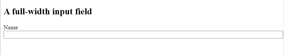
<h2>A full-width input field</h2>
<form>
<label for="name">Name</label>
<input type="text" id="name" name="fname">
</form>
</body>
</html>Output
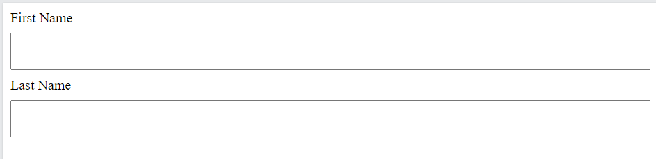
Padded Inputs in CSS Forms
Use the padding property to add space inside the text field.
<!DOCTYPE html>
<html>
<head>
<style>
input[type=text] {
  width: 100%;
  padding: 12px 20px;
  margin: 8px 0;
  box-sizing: border-box;
}
</style>
</head>
<body>


<form>
  <label for="name">First Name</label>
  <input type="text" id="name" name="fname">
  <label for="name">Last Name</label>
  <input type="text" id="name" name="lname">
</form>

</body>
</html>Output
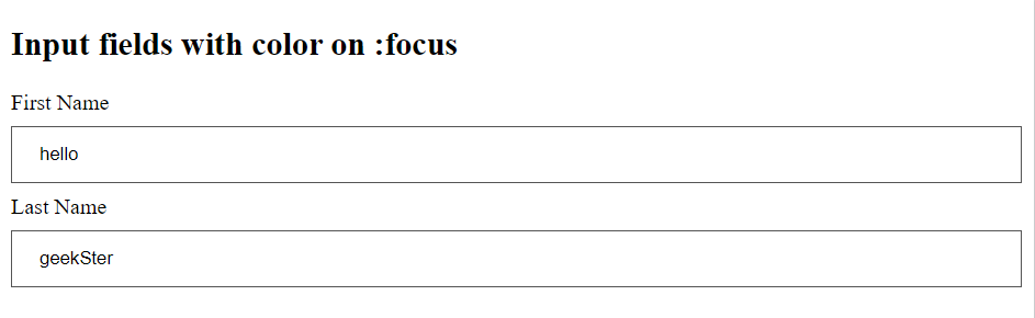
Focused Inputs in CSS Forms
By default, some browsers will add a blue outline around the input when it gets focus (clicked on). You can remove this behavior by adding outline: none; to the input.
<!DOCTYPE html>
<html>
<head>
<style>
input[type=text] {
  width: 100%;
  padding: 12px 20px;
  margin: 8px 0;
  box-sizing: border-box;
  border: 1px solid #555;
  outline: none;
}

input[type=text]:focus {
  background-color: lightblue;
}
</style>
</head>
<body>

<h2>Input fields with color on :focus</h2>

<form>
  <label for="fname">First Name</label>
  <input type="text" id="fname" name="fname" value="John">
  <label for="lname">Last Name</label>
  <input type="text" id="lname" name="lname" value="Doe">
</form>

</body>
</html>Output
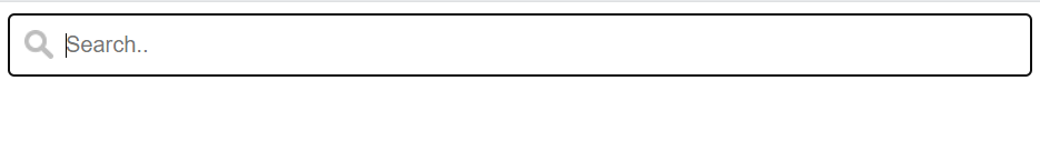
Input with Icon/Image
If you want an icon inside the input, use the background-image property and position it with the background-position property.
input[type=text] {
  width: 100%;
  box-sizing: border-box;
  border: 2px solid #ccc;
  border-radius: 4px;
  font-size: 16px;
  background-color: white;
  background-image: url('searchicon.png');
  background-position: 10px 10px;
  background-repeat: no-repeat;
  padding: 12px 20px 12px 40px;
}Output
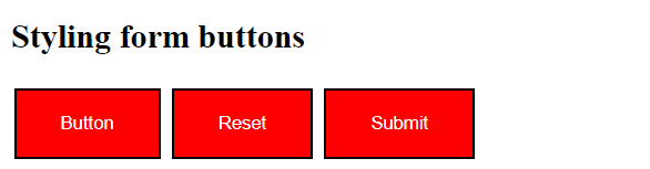
Input Buttons
input[type=button], input[type=submit], input[type=reset] {
  background-color: red;
  border: 2px solid black;
  color: white;
  padding: 16px 32px;
  text-decoration: none;
  margin: 4px 2px;
  cursor: pointer;
}Output
Conclusion
CSS form styling is a fundamental aspect of web design that significantly impacts the user experience and usability of web forms. By leveraging CSS properties and techniques, web developers can customize the appearance, layout, and behavior of form elements to create visually appealing, user-friendly, and accessible forms. Whether it’s improving form usability, ensuring accessibility, or making forms responsive, CSS plays a crucial role in enhancing the functionality and aesthetics of web forms. By considering best practices and user-centered design principles, CSS forms can contribute to an overall positive user experience on websites.
Frequently Asked Questions
CSS forms styling refers to the process of using Cascading Style Sheets to customize the appearance and layout of HTML forms. It is important because it enhances the visual appeal of forms, improves user experience, and ensures consistency with the overall design of the website.
2. How can CSS be used to improve form usability?
CSS can improve form usability by customizing the appearance of form elements, providing clear visual cues for user interaction (such as hover and focus effects), ensuring proper alignment and spacing, and enhancing readability with appropriate fonts and colors.
3. Are there any accessibility considerations when styling forms with CSS?
Yes, accessibility considerations are crucial when styling forms with CSS. It’s essential to ensure that form elements remain accessible to all users, including those with disabilities. This involves using semantic HTML markup, providing descriptive labels, maintaining sufficient color contrast, and ensuring keyboard accessibility.
