Introduction
In CSS, the float property is used to align elements horizontally within their container. Originally designed for text wrapping around images, it’s now commonly used for creating layouts. Here’s a concise overview:
- Values: The float property offers two main values:
- left: This value positions the element to the left within its container, allowing subsequent elements to flow around it on the right side.
- right: Conversely, this value aligns the element to the right within its container, enabling subsequent elements to flow around it on the left side.
- Usage: Floating elements is a technique frequently utilized in creating multi-column layouts or arranging elements side by side. However, it’s vital to acknowledge that floated elements disrupt the normal document flow, potentially impacting the layout and positioning of other elements. Consequently, neighboring elements may shift unpredictably, causing unintended layout distortions.
- Clearing Floats: While floating elements, it’s common to encounter issues where subsequent elements don’t behave as expected due to the presence of floated elements. Consequently, these elements may fail to align or wrap as intended, leading to layout inconsistencies. To mitigate this, the clear property can be employed to prevent elements from wrapping around floated elements. Common values for clear include left, right, both, or none.
- Collapsing Containers: A notable characteristic of floated elements is their ability to cause their container to collapse if not properly cleared. This means that the container may fail to expand to contain its floated children, resulting in layout irregularities. Thus, clearing floats or implementing techniques like clearfixes becomes crucial to prevent container collapse and ensure consistent layout behavior.
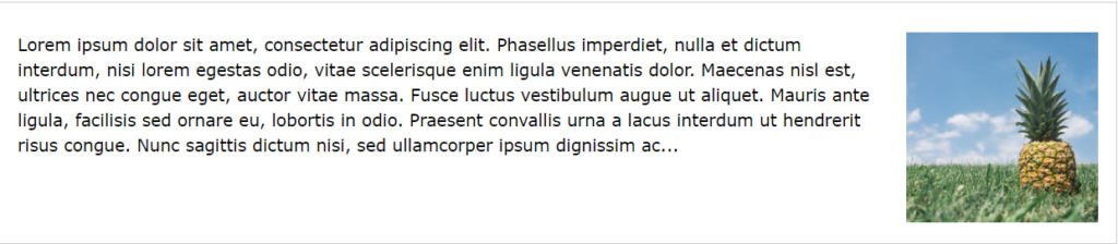
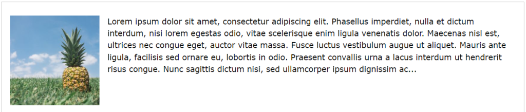
The CSS float property specifies how an element should float.
img {
  float: right;
}Output
img {
  float: left;
}Output
<!DOCTYPE html>
<html>
<head>
<style>
div {
float: left;
padding: 15px;
}
.div1 {
background: red;
}
.div2 {
background: yellow;
}
.div3 {
background: green;
}
</style>
</head>
<body>
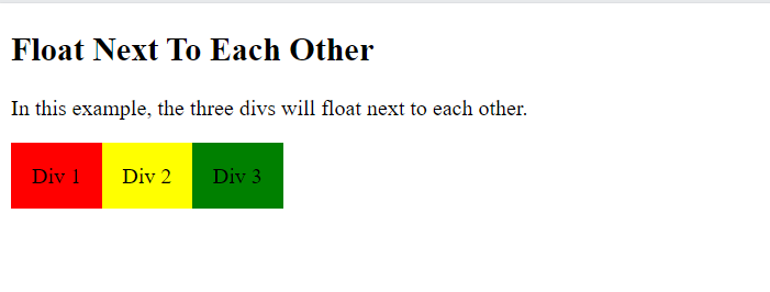
<h2>Float Next To Each Other</h2>
<p>In this example, the three divs will float next to each other.</p>
<div class="div1">Div 1</div>
<div class="div2">Div 2</div>
<div class="div3">Div 3</div>
</body>
</html>
Output
When we use the float property, and we want the next element below (not on right or left), we will have to use the clear property.
The clear property specifies what should happen with the element that is next to a floating element.
The clear property can have one of the following values:
none– The element is not pushed below left or right floated elements. This is defaultleft– The element is pushed below left floated elementsright– The element is pushed below right floated elementsboth– The element is pushed below both left and right floated elementsinherit– The element inherits the clear value from its parent
<!DOCTYPE html>
<html>
<head>
<style>
.div1 {
float: left;
padding: 10px;
border: 3px solid #73AD21;
}
.div2 {
padding: 10px;
border: 3px solid red;
}
.div3 {
float: left;
padding: 10px;
border: 3px solid #73AD21;
}
.div4 {
padding: 10px;
border: 3px solid red;
clear: left;
}
</style>
</head>
<body>
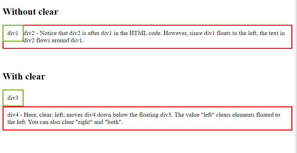
<h2>Without clear</h2>
<div class="div1">div1</div>
<div class="div2">div2 - Notice that div2 is after div1 in the HTML code. However, since div1 floats to the left, the text in div2 flows around div1.</div>
<br><br>
<h2>With clear</h2>
<div class="div3">div3</div>
<div class="div4">div4 - Here, clear: left; moves div4 down below the floating div3. The value "left" clears elements floated to the left. You can also clear "right" and "both".</div>
</body>
</html>
Output
The clear fix Hack
If a floated element is taller than the containing element, it will “overflow” outside of its container. We can then add a clearfix hack to solve this problem:
<!DOCTYPE html>
<html>
<head>
<style>
div {
border: 3px solid #4CAF50;
padding: 5px;
}
.img1 {
float: right;
}
.img2 {
float: right;
}
.clearfix {
overflow: auto;
}
</style>
</head>
<body>
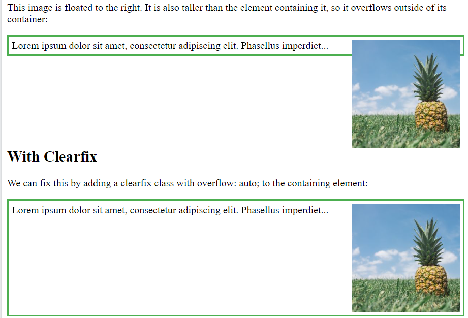
<h2>Without Clearfix</h2>
<p>This image is floated to the right. It is also taller than the element containing it, so it overflows outside of its container:</p>
<div>
<img class="img1" src="pineapple.jpg" alt="Pineapple" width="170" height="170">
Lorem ipsum dolor sit amet, consectetur adipiscing elit. Phasellus imperdiet...
</div>
<h2 style="clear:right">With Clearfix</h2>
<p>We can fix this by adding a clearfix class with overflow: auto; to the containing element:</p>
<div class="clearfix">
<img class="img2" src="pineapple.jpg" alt="Pineapple" width="170" height="170">
Lorem ipsum dolor sit amet, consectetur adipiscing elit. Phasellus imperdiet...
</div>
</body>
</html>
Output
<!DOCTYPE html>
<html>
<head>
<style>
* {
box-sizing: border-box;
}
.img-container {
float: left;
width: 33.33%;
padding: 5px;
}
.clearfix::after {
content: "";
clear: both;
display: table;
}
</style>
</head>
<body>
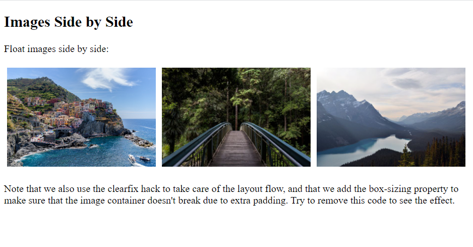
<h2>Images Side by Side</h2>
<p>Float images side by side:</p>
<div class="clearfix">
<div class="img-container">
<img src="img_5terre.jpg" alt="Italy" style="width:100%">
</div>
<div class="img-container">
<img src="img_forest.jpg" alt="Forest" style="width:100%">
</div>
<div class="img-container">
<img src="img_mountains.jpg" alt="Mountains" style="width:100%">
</div>
</div>
<p>Note that we also use the clearfix hack to take care of the layout flow, and that we add the box-sizing property to make sure that the image container doesn't break due to extra padding. Try to remove this code to see the effect.</p>
</body>
</html>
Output
Conclusion
In conclusion, CSS float has been a cornerstone of web design, facilitating the creation of horizontal layouts and the positioning of elements in close proximity. It’s commonly leveraged for tasks such as image alignment, text wrapping, and the establishment of basic multi-column layouts. However, despite its widespread use, CSS float does come with limitations. These limitations include its impact on document flow and the potential for container collapse. Consequently, while CSS float offers valuable functionality, it’s important to consider its drawbacks and explore alternative layout techniques for more complex design requirements..
While CSS float remains relevant in specific contexts, modern CSS layout techniques like Flexbox and CSS Grid offer more robust alternatives for crafting intricate and responsive layouts. Moreover, these advanced techniques provide finer control over layout elements, allowing for more precise positioning and alignment. Additionally, Flexbox and CSS Grid offer features such as automatic resizing and alignment capabilities, enhancing the flexibility and adaptability of web layouts. Consequently, while CSS float has its place in web design history, embracing newer layout methods empowers designers to create more dynamic and visually engaging websites. These newer methods provide greater flexibility and control over the positioning and alignment of elements, leading to more dynamic and adaptable designs.
When employing CSS float, it’s crucial to fully understand its behavior and limitations. Additionally, implementing techniques like clearfixes can help mitigate potential layout issues. Nonetheless, as web design continues to evolve, CSS float is gradually being replaced by these more modern and versatile layout approaches.
Overall, while CSS float has played a significant role in shaping the visual landscape of the web, its prominence is gradually giving way to more advanced and flexible layout methodologies.
Frequently Asked Questions
Ans: CSS float is primarily used for creating simple layouts where elements need to be positioned horizontally next to each other. It’s commonly used for things like wrapping text around images or creating multi-column layouts.
Q2. Can I float non-block-level elements?
Ans: No, CSS float only applies to block-level elements. Inline elements cannot be floated. However, you can convert inline elements to block-level using CSS properties like display: block; before applying float.
Q3. How do I clear floats in CSS?
Ans: To prevent elements from wrapping around floated elements, you can use the clear property. Adding clear: both; to an element ensures that it appears below any floated elements, effectively clearing the floats.
Q4. What are the drawbacks of using CSS float?
Ans: CSS float can cause container collapse, where a container doesn’t properly contain its floated children. This can lead to layout issues if not addressed with clearfix techniques or modern layout methods.
Ans: While CSS float still finds application in certain scenarios, modern layout techniques such as Flexbox and CSS Grid offer more powerful and flexible options for creating complex layouts. Consequently, floats are less commonly utilized in modern web design due to their limitations and quirks.
