Introduction
In Cascading Style Sheets (CSS), the borders property is used to define the border of an element. Borders can be applied to various HTML elements such as <div>, <p>, <span>, etc., to provide visual separation or emphasis.
Understanding CSS Border Properties
1.Border Style
The border-style the property specifies what kind of border to display.
The following values are allowed:
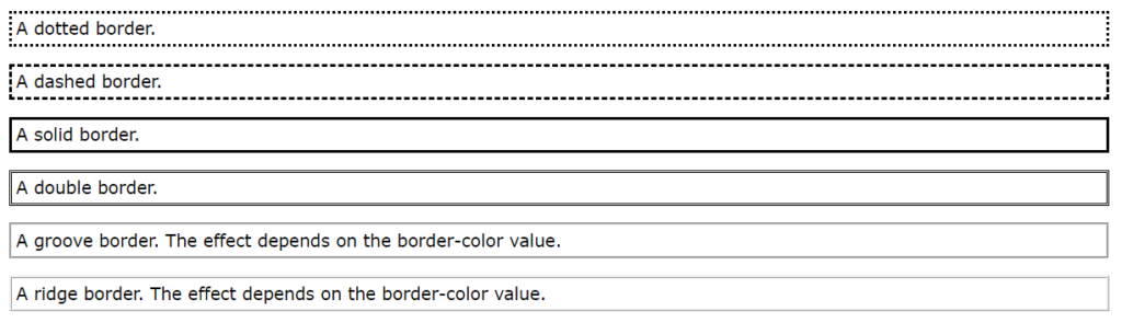
dotted– Defines a dotted borderridge– Defines a 3D ridged border. The effect depends on the border-color valuedashed– Defines a dashed bordersolid– Defines a solid bordergroove– Defines a 3D grooved border. The effect depends on the border-color valueinset– Defines a 3D inset border. The effect depends on the border-color valueoutset– Defines a 3D outset border. The effect depends on the border-color valuenone– Defines no borderdouble– Defines a double borderhidden– Defines a hidden border
The border-style property can have from one to four values (for the top border, right border, bottom border, and the left border).
div.dotted {border-style: dotted;}
div.dashed {border-style: dashed;}
div.solid {border-style: solid;}
div.double {border-style: double;}
div.groove {border-style: groove;}
div.ridge {border-style: ridge;}
output
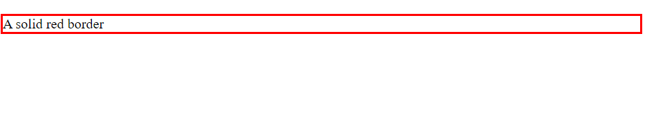
2.Border Width
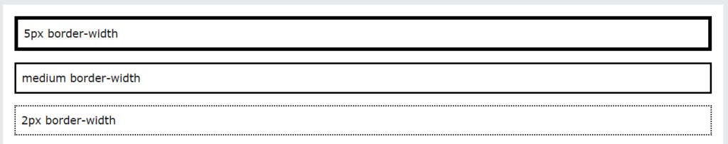
- The width of the border can be specified using the
border-widthproperty. It accepts values in pixels, ems, rems, percentages, or keywords likethin,medium, andthick. - Example:
border-width: 2px;
div.d-one {
  border-style: solid;
  border-width: 5px;
}

div.d-two {
  border-style: solid;
  border-width: medium;
}

div.d-three {
  border-style: dotted;
border-width: 2px;Output
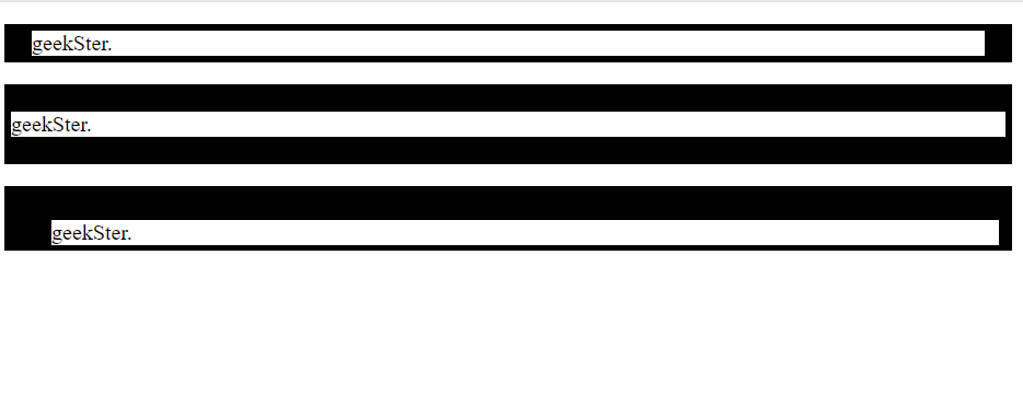
- You can specify different border properties for each side of an element using individual properties like
border-top,border-right,border-bottom, andborder-left. - Example:
border-top: 1px solid #000000;
- border-width: top right bottom left;
<!DOCTYPE html>
<html>
<head>
<style>
p.p-one {
  border-style: solid;
  border-width: 5px 20px; /* 5px top and bottom, 20px on the sides */
}

p.p-two {
  border-style: solid;
  border-width: 20px 5px; /* 20px top and bottom, 5px on the sides */
}

p.p-three {
  border-style: solid;
  border-width: 25px 10px 4px 35px; /* 25px top, 10px right, 4px bottom and 35px left */
}
</style>
</head>
<body>


<p class="p-one">geekSter.</p>
<p class="p-two">geekSter.</p>
<p class="p-three">geekSter.</p>

</body>
</html>Output
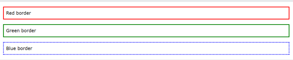
3.Border Color
- The color of the border can be set using the
border-colorproperty. It accepts color values in various formats like hexadecimal, RGB, RGBA, HSL, HSLA, or color names. - Example:
border-color: #000000;
<!DOCTYPE html>
<html>
<head>
<style>
p.p-one {
  border-style: solid;
  border-color: red;
}

p.p-two {
  border-style: solid;
 border-color: green;
}

p.p-three {
  border-style: solid;
   border-color: blue; /* 25px top, 10px right, 4px bottom and 35px left */
}
</style>
</head>
<body>


<p class="p-one">geekSter.</p>
<p class="p-two">geekSter.</p>
<p class="p-three">geekSter.</p>

</body>
</html>Output
4.Using HSL Values
p.p-one {
  border-style: solid;
  border-color: red;
}
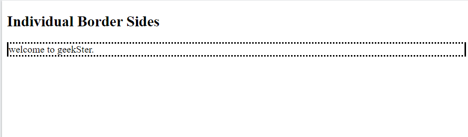
Border – Individual Sides
<!DOCTYPE html>
<html>
<head>
<style>
div {
  border-top-style: dotted;
  border-right-style: solid;
  border-bottom-style: dotted;
  border-left-style: solid;
}
</style>
</head>
<body>

<h2>Individual Border Sides</h2>
<div>welcome to geekSter.</div>

</body>
</html>
Output
border-style property behaves with different numbers of values. These examples help understand how the values are applied to each border of an element:
- Four Values:
border-style: dotted solid double dashed;- The top border is dotted
- The right border is solid
- The bottom border is double
- The left border is dashed
- Three Values:
border-style: dotted solid double;- The top border is dotted
- The right and left borders are solid
- The bottom border is double
- Two Values:
border-style: dotted solid;- The top and bottom borders are dotted
- The right and left borders are solid
- One Value:
border-style: dotted;- All four borders are dotted
Understanding these patterns makes it easier to style borders precisely in CSS, allowing for greater control over the visual appearance of web elements.
Removing Borders:
- To remove the border from an element, you can set the
borderproperty tonone, or you can specifyborder-width: 0. - Example:
border: none;
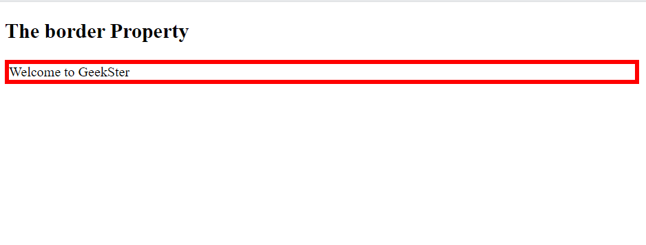
Shorthand Border Property
- CSS provides a shorthand
borderproperty to specify all border properties (width, style, and color) in a single declaration. - Example:
border: 2px solid #000000;
<!DOCTYPE html>
<html>
<head>
<style>
p {
  border: 5px solid red;
}
</style>
</head>
<body>

<h2>The border Property</h2>

<p>Welcome to GeekSter</p>

</body>
</html>
Output
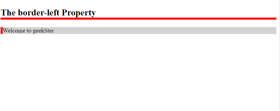
- Left Border and Bottom Border
<!DOCTYPE html>
<html>
<head>
<style>
p {
  border-left: 6px solid red;
  background-color: lightgrey;
}
h2 {
  border-bottom: 6px solid red;
}
</style>
</head>
<body>

<h2>The border-left Property</h2>
<p>Welcome to geekSter</p>

</body>
</html>
output
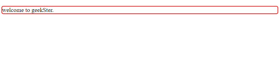
Rounded Borders
- The
border-radiusproperty is used to create rounded corners for the border. It accepts values in pixels, ems, rems, percentages, etc. - Example:
border-radius: 5px;
<!DOCTYPE html>
<html>
<head>
<style>
p {
  border: 2px solid red;
  border-radius: 5px;
}
</style>
</head>
<body>


<p>welcome to geekSter.</p>

</body>
</html>
Output
Conclusion
CSS borders are a versatile tool for styling HTML elements, providing designers with the ability to create visually appealing layouts and add structure to web pages. By understanding how to manipulate border properties such as width, style, color, radius, and image, developers can achieve a wide range of border effects to suit their design requirements.
Whether it’s creating simple solid borders, adding rounded corners for a modern look, or incorporating intricate designs using images or gradients, CSS offers the flexibility and control needed to achieve the desired visual effects. By mastering CSS borders, designers can enhance the appearance and usability of their web projects, creating engaging user experiences across various devices and screen sizes.
Frequently Asked Questions
Use the border-radius property to specify the radius of each corner, creating a rounded border effect. For example:
.rounded-border {
border: 2px solid #000000;
border-radius: 10px; /* Rounded corners with a radius of 10px */
}
While CSS does not support gradient borders directly, you can achieve a similar effect by using background gradients combined with padding and/or box-shadow properties to create the appearance of a gradient border.
To create a transparent border, set the border-color property to transparent. This will make the border color transparent, allowing the background color or content behind it to show through.
Yes, you can use individual border properties like border-top, border-right, border-bottom, and border-left to apply borders selectively to specific sides of an element.
