Introduction
In CSS, alignment(align) refers to the positioning of elements within their containers or relative to other elements on a web page. CSS provides several properties to control alignment, including:
- Text Alignment (
text-align): This property specifies the horizontal alignment of text content within its container. Values such asleft,right,center, andjustifycan be used to align text accordingly. - Vertical Alignment (
vertical-align): Used primarily for inline and table-cell elements,vertical-aligncontrols the vertical positioning of an element within its parent element. Common values includetop,middle,bottom,baseline, and length values. - Horizontal Alignment (
margin,padding,float,position): These properties are used to horizontally align block-level elements within their containers or relative to other elements. Techniques such as settingmargintoautocan center an element horizontally, whilefloatandpositionproperties can be used for more complex layouts. - Flexbox (
align-items,justify-content): Flexbox is a CSS layout model that provides powerful alignment capabilities. Properties likealign-itemsandjustify-contentallow for precise control over the alignment of flex container items both horizontally and vertically. - Grid Layout (
align-items,justify-items): CSS Grid Layout offers extensive alignment features for grid container items. Properties such asalign-itemsandjustify-itemscontrol the alignment of items along the grid’s rows and columns, respectively.
.center {
  margin: auto;
  width: 50%;
  border: 3px solid green;
  padding: 10px;
}Output

Align Text
To center the text inside an element, use text-align: center;
div {
  text-align: center;
  border: 3px solid green;
}Output

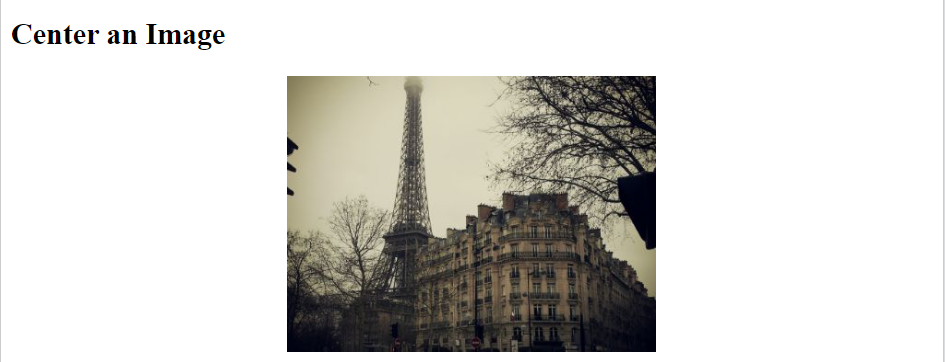
Center an Image
To center an image, set left and right margin to auto and make it into a block element:
img {
  display: block;
  margin-left: auto;
  margin-right: auto;
  width: 40%;
}Output

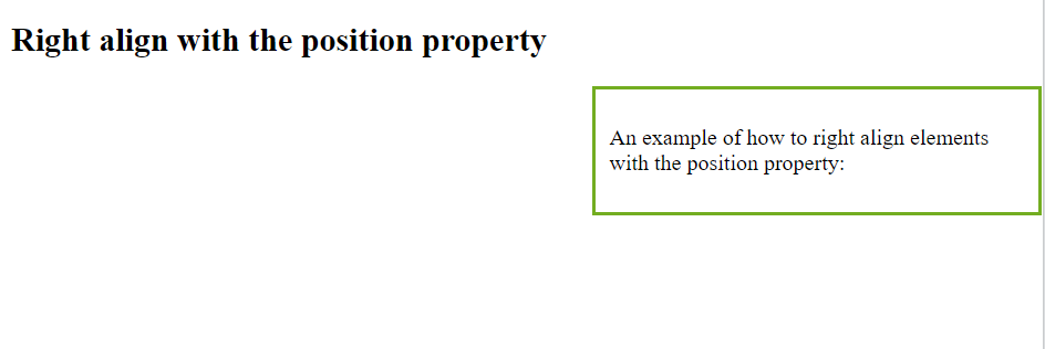
Left and Right Align – Using Position
Method for aligning elements is to use position: absolute;:
.right-align {
  position: absolute;
  right: 0px;
  width: 300px;
  border: 3px solid #73AD21;
  padding: 10px;
}Output

Left and Right Align – Using the Float
Another method for aligning elements is to use the float property:
.right {
  float: right;
  width: 300px;
  border: 3px solid #73AD21;
  padding: 10px;
}Output

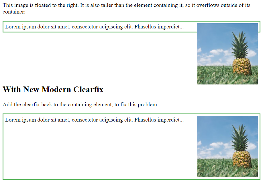
Note: If an element is taller than the element containing it, and it is floated, it will overflow outside of its container. You can use the “clearfix hack” to fix this
<!DOCTYPE html>
<html>
<head>
<style>
div {
  border: 3px solid #4CAF50;
  padding: 5px;
}

.img1 {
  float: right;
}

.img2 {
  float: right;
}

.clearfix::after {
  content: "";
  clear: both;
  display: table;
}
</style>
</head>
<body>

<h2>Without Clearfix</h2>

<p>This image is floated to the right. It is also taller than the element containing it, so it overflows outside of its container:</p>

<div>
  <img class="img1" src="pineapple.jpg" alt="Pineapple" width="170" height="170">
  Lorem ipsum dolor sit amet, consectetur adipiscing elit. Phasellus imperdiet...
</div>

<h2 style="clear:right">With New Modern Clearfix</h2>
<p>Add the clearfix hack to the containing element, to fix this problem:</p>

<div class="clearfix">
  <img class="img2" src="pineapple.jpg" alt="Pineapple" width="170" height="170">
  Lorem ipsum dolor sit amet, consectetur adipiscing elit. Phasellus imperdiet...
</div>

</body>
</html>
Output

center both vertically and horizontally, use padding and text-align: center:
.center {
  padding: 70px 0;
  border: 3px solid green;
  text-align: center;
}Output

Center Vertically – Using Line-Height
Another trick is to use the line-height property with a value that is equal to the height property:
.center {
  line-height: 200px;
  height: 200px;
  border: 3px solid green;
  text-align: center;
}

/* If the text has multiple lines, add the following: */
.center p {
  line-height: 1.5;
  display: inline-block;
  vertical-align: middle;
}Output

Using Position & Transform
If padding and line-height are not options, another solution is to use positioning and the transform property:
.center {
  height: 200px;
  position: relative;
  border: 3px solid green;
}

.center p {
  margin: 0;
  position: absolute;
  top: 50%;
  left: 50%;
  transform: translate(-50%, -50%);
}Output

Using Flexbox
You can also use Flexbox to center things.
.center {
  display: flex;
  justify-content: center;
  align-items: center;
  height: 200px;
  border: 3px solid green;
}Output

Conclusion
CSS alignment properties are fundamental tools for creating well-structured and visually appealing layouts in web design. Whether aligning text content, positioning elements horizontally or vertically, or controlling alignment within flexbox or grid layouts, CSS provides versatile solutions to meet design requirements. By mastering CSS alignment techniques, designers can achieve precise control over the positioning and presentation of elements on a web page, enhancing overall aesthetics and user experience.
Frequently Asked Questions
text-align and vertical-align in CSS? Ans: text-align is used to horizontally align text content within its container, while vertical-align is used to vertically align inline or table-cell elements within their parent element.
Q2. How can I center an element horizontally in CSS?
Ans: You can center an element horizontally by setting its margin property to auto, provided it has a defined width. Alternatively, with flexbox, you can use justify-content: center;.
Q3. What is the difference between
align-items and justify-content in Flexbox? Ans: align-items aligns flex container items along the cross-axis (vertical alignment for a row layout, horizontal alignment for a column layout), while justify-content aligns items along the main-axis (horizontal for a row layout, vertical for a column layout).
Q4. Can I vertically align an element within a container with unknown height?
Ans: Yes, you can vertically align an element within a container with unknown height using flexbox. Set the container’s display property to flex and use align-items: center; to vertically center the element.
Q5. How do I align items in a CSS grid?
Ans: In CSS Grid Layout, you can use properties like align-items and justify-items to align grid items along the rows and columns, respectively. These properties work similarly to flexbox alignment properties.

