
Introduction
CSS 3D transforms extend the capabilities of CSS transforms to manipulate elements in three-dimensional space, allowing developers to create immersive and interactive web experiences. Here’s a summary of key points regarding CSS 3D transforms
Features of 3D Transforms
- Perspective:
- The
perspectiveproperty sets the depth of the 3D space in which transformed elements are rendered. It determines the distance between the viewer and the transformed elements, influencing the perceived depth and perspective.
- The
- 3D Rotation:
- CSS 3D transforms introduce additional functions for rotating elements in three dimensions:
rotateX(): Rotates an element around its horizontal axis.rotateY(): Rotates an element around its vertical axis.rotateZ(): Rotates an element around its depth axis (perpendicular to the screen).
- CSS 3D transforms introduce additional functions for rotating elements in three dimensions:
- 3D Translation:
- Similarly to 2D translations, CSS 3D transforms allow for translations in three dimensions using
translate3d(). This function moves an element along the X, Y, and Z axes in 3D space.
- Similarly to 2D translations, CSS 3D transforms allow for translations in three dimensions using
- 3D Scaling:
- Scaling can also be applied in three dimensions using
scale3d(). This function scales an element along the X, Y, and Z axes independently, allowing for non-uniform scaling effects.
- Scaling can also be applied in three dimensions using
- 3D Perspective Origin:
- The
transform-originproperty specifies the origin point of transformations in 3D space. By default, transformations are applied relative to the center of the element, but the origin point can be adjusted horizontally and vertically.
- The
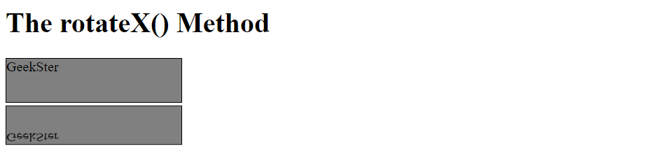
The rotateX() Method of 3D Transforms
div {
  width: 200px;
  height: 50px;
  background-color: gray;
  border: 1px solid black;
}

#myDiv {
  transform: rotateX(150deg);
}Output
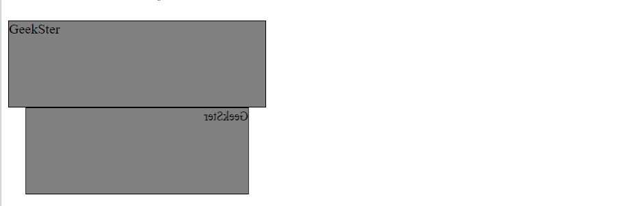
The rotateY() Method of 3D Transforms
#myDiv {
  transform: rotateY(150deg);
}Output
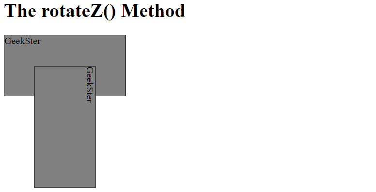
The rotateZ() Method of 3D Transforms
The rotateZ() method rotates an element around its Z-axis at a given degree:
div {
  width: 200px;
  height: 100px;
  background-color: gray;
  border: 1px solid black;
}

#myDiv {
  transform: rotateZ(90deg);
}Output
Conclusion
CSS 3D transformations provide developers with powerful tools to create immersive and interactive 3D effects in web design. By leveraging perspective, rotation, translation, and scaling in three dimensions, designers can bring depth and realism to web interfaces, enhancing user experience and engagement. While CSS 3D transformations offer vast creative possibilities, it’s essential to optimize performance and ensure compatibility with different browsers and devices. With careful implementation and experimentation, CSS 3D transformations can elevate the visual appeal and interactivity of web projects, making them stand out in the digital landscape.
Frequently Asked Questions
Yes, you can combine CSS 3D transformations with animations and transitions to create dynamic and interactive effects. By specifying keyframes or transition properties for the transform property, you can animate 3D transformations smoothly.
Most modern browsers support CSS 3D transformations, including Google Chrome, Mozilla Firefox, Safari, and Microsoft Edge. However, it’s essential to test and ensure compatibility with older browsers or devices that may have limited support.
To optimize performance, developers should minimize the number of complex transformations applied to elements, especially on mobile devices. Additionally, using hardware-accelerated rendering techniques and avoiding unnecessary repaints can improve rendering performance.
