Introduction
In the world of data analysis, presenting your findings in an easily understandable format is crucial. Google Sheets offers a range of tools for creating impactful charts and dashboards that transform raw data into insightful visualizations. This article will guide you through the essential functions and techniques, including the IMPORTRANGE function, pivot charts, dashboards, and Key Performance Indicators (KPIs). You will learn to create dynamic and informative dashboards for any data analysis task.
Understanding Charts and Dashboards
What Are Charts and Dashboards?
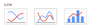
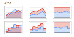
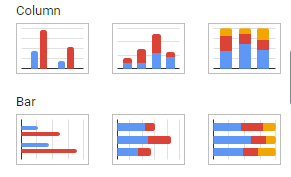
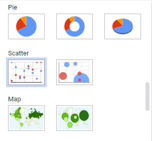
- Charts: Visual representations of data that make complex information easier to understand. Examples include bar charts, line charts, pie charts, and more.
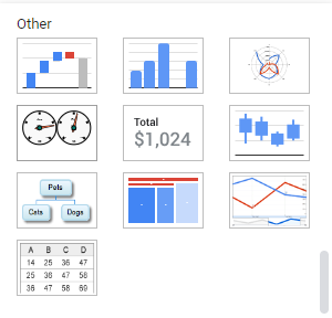
- Dashboards: Interactive, visual displays of key data points and trends. Dashboards combine multiple charts and visualizations to provide a comprehensive view of data.
Key Benefits:
- Clarity: Charts and dashboards make data comprehensible at a glance.
- Insights: They help identify trends, patterns, and outliers.
- Efficiency: Simplify data reporting and decision-making processes.
Essential Functions for Data Visualization
IMPORTRANGE Function:
The IMPORTRANGE function allows you to import data from one Google Sheets file to another, enabling seamless data integration and analysis.
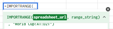
- Syntax:
=IMPORTRANGE(spreadsheet_url, range_string) spreadsheet_url– The URL of the spreadsheet from which data will be imported.- The value for
spreadsheet_urlmust either be enclosed in quotation marks or be a reference to a cell containing the URL of a spreadsheet.
- The value for
range_string– A string, of the format"[sheet_name!]range"(e.g."Sheet1!A2:B6"or"A2:B6") specifying the range to import.- The
sheet_namecomponent ofrange_stringis optional; by defaultIMPORTRANGEwill import from the given range of the first sheet. - The value for
range_stringmust either be enclosed in quotation marks or be a reference to a cell containing the appropriate text.
- The
- Example:
=IMPORTRANGE("<https://docs.google.com/spreadsheets/d/your_spreadsheet_id/edit>", "Sheet1!A1:D10")
Key Features:
- Data Integration: Combine data from multiple sources.
- Real-Time Updates: Imported data updates automatically when the source data changes.
- Flexibility: Use in conjunction with other functions and charts for dynamic reporting.
Creating Pivot Charts
Pivot Charts in Google Sheets:
Pivot charts are powerful tools that visualize the summarized data from pivot tables. They allow you to analyze and present data interactively.
Step-by-Step Guide to Creating a Pivot Chart:
- Create a Pivot Table: Select your dataset, go to
Data>Pivot table, and configure your pivot table.
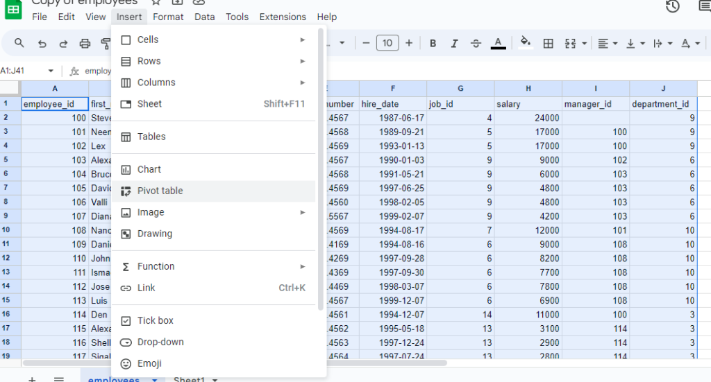
2. Insert Chart: Click on the pivot table, then go to Insert > Chart.
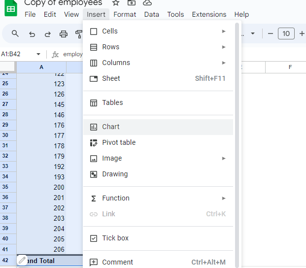
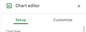
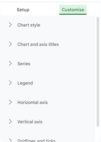
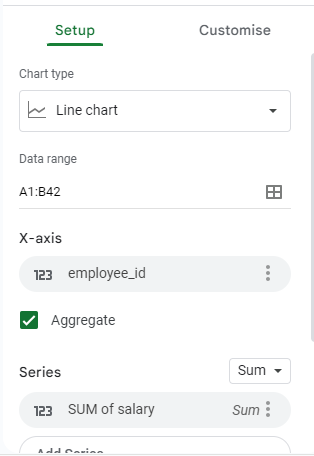
3. Customize Chart: Choose the chart type and customize it using the Chart Editor to match your data analysis needs.
Benefits of Pivot Charts:
- Dynamic Analysis: Automatically update as pivot table data changes.
- Visual Clarity: Highlight trends and patterns in summarized data.
- Customization: Tailor charts to specific data insights.
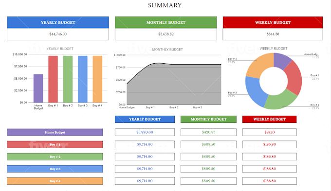
Building Dashboards with KPIs
Dashboards and Key Performance Indicators (KPIs):
Dashboards are comprehensive visual displays of key metrics and data points. KPIs are specific measurements used to evaluate performance over time.
Steps to Build an Effective Dashboard:
- Identify Key Metrics: Determine the KPIs that are most relevant to your goals.
- Gather Data: Use the
IMPORTRANGEfunction to compile data from various sources. - Create Pivot Tables and Charts: Summarize and visualize data using pivot tables and charts.
- Design the Dashboard: Arrange your charts and data visualizations on a single sheet for a cohesive view.
- Add Interactivity: Use slicers, drop-down menus, and conditional formatting to enhance user interaction.
Example KPIs for a Sales Dashboard:
- Total Sales: Sum of sales revenue over a period.
- Sales by Region: Breakdown of sales by geographical region.
- Monthly Sales Growth: Comparison of sales performance month over month.
- Top Products: List of best-selling products.
Advanced Tips for Google Sheets Dashboards
1. Using Slicers:
- Slicers: Interactive controls that allow users to filter data in pivot tables and charts. Add slicers to make your dashboard more dynamic and user-friendly.
2. Conditional Formatting:
- Highlight Key Data: Use conditional formatting to draw attention to important data points, such as exceeding sales targets or identifying underperforming areas.
3. Real-Time Updates:
- Dynamic Dashboards: Ensure your dashboard reflects the latest data by leveraging functions like
IMPORTRANGEand regularly updating your source data.
4. Data Validation:
- Clean Data Entry: Use data validation rules to maintain data integrity and consistency, ensuring accurate analysis and reporting.
Conclusion
Creating charts and dashboards in Google Sheets is a powerful way to visualize and communicate data insights. By mastering functions like IMPORTRANGE, creating pivot charts, and designing comprehensive dashboards with KPIs, you can transform raw data into actionable information. Whether you’re tracking sales performance, monitoring project progress, or analyzing any other data, Google Sheets provides the tools you need to make your data analysis impactful and accessible.
Frequently Asked Questions
To share your dashboard, click on the Share button in the top right corner of Google Sheets. You can then enter email addresses or generate a shareable link. Adjust permissions to control whether others can view or edit the dashboard.
Use functions like IMPORTRANGE and set your source data to update regularly. Google Sheets will automatically refresh your dashboard as the underlying data changes.
Yes, you can. To embed a chart, click on the chart, select the three-dot menu, and choose Publish chart. Copy the embed code provided and paste it into your website or presentation.