Introduction
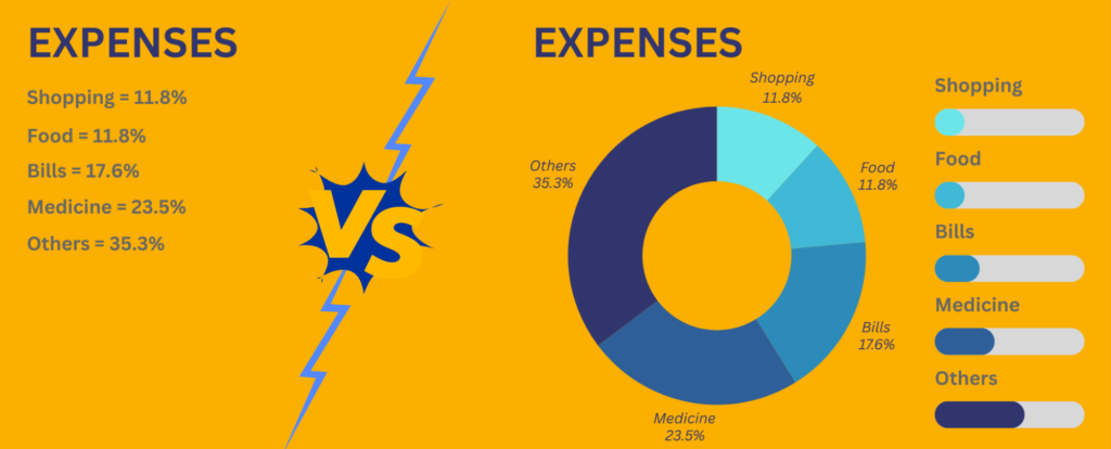
Before we start Out of these two expense report that you see which one do you find easier to understand?
I am sure it’s the 2nd report with chart in it but the question here is why so? Because our mind reads pictures before text and that is why it is important to learn charts so that you can make your data and reports easier to read and understand.
Charts in Power BI are visual representations of data that help users understand and analyze information more effectively. They transform raw data into a visual format, making it easier to spot trends, patterns, and insights that might not be immediately apparent from tables or text-based data.
But Now you must be thinking Why Power Bi?
Power BI developed by Microsoft, offers a wide range of chart types and customization options that allow users to create compelling visualizations. This article will guide you through the basics of charts in Power BI, explaining various chart types, their usage, and the steps to create a basic dashboard.
Types of Charts in Power BI
Some Basic Charts Used in Power BI are:
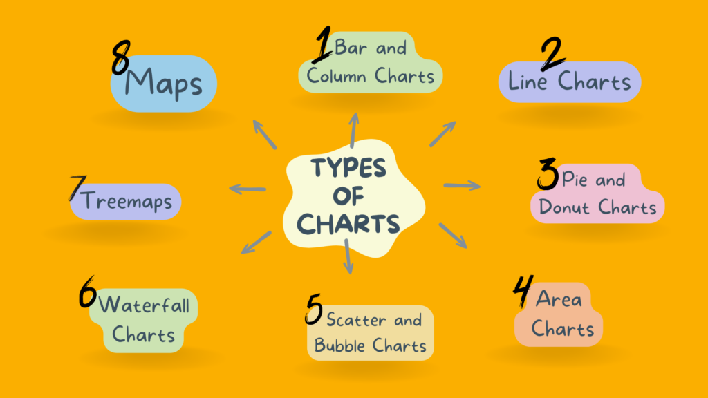
Power BI provides a variety of chart types, each suited for different types of data and analytical needs. Understanding these charts and their applications can help you choose the right visualization for your data.
Bar and Column Charts
Bar Charts:
- Purpose: Used to compare data across different categories.
- Structure: Horizontal bars.
- Use Cases: Comparing sales across regions, customer satisfaction scores across different services.
- Advantages: Easy to read and suitable for categorical data.
Stacked Bar Charts:
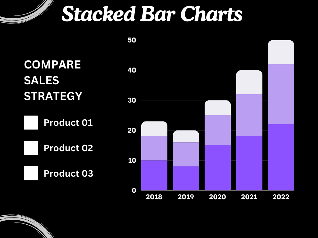
- Purpose: Show the composition and comparison of different categories.
- Structure: Horizontal bars divided into segments representing subcategories.
- Use Cases: Sales by product categories and subcategories, expenditures across departments.
- Advantages: Shows the total and individual contributions to the total.
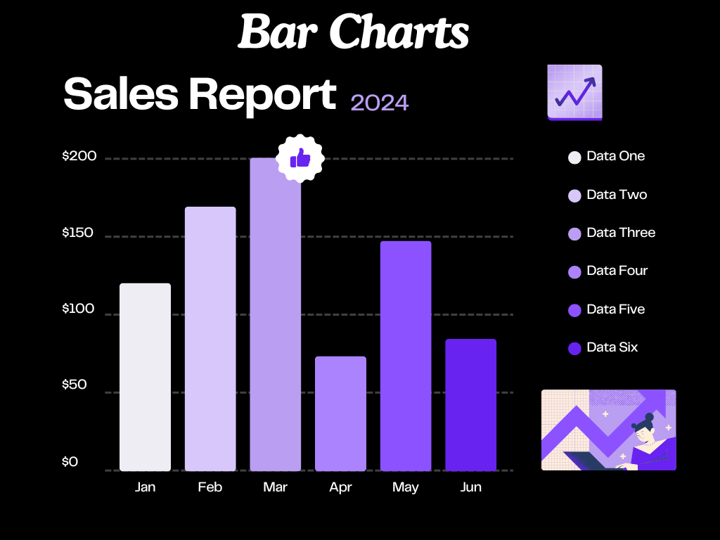
Column Charts:
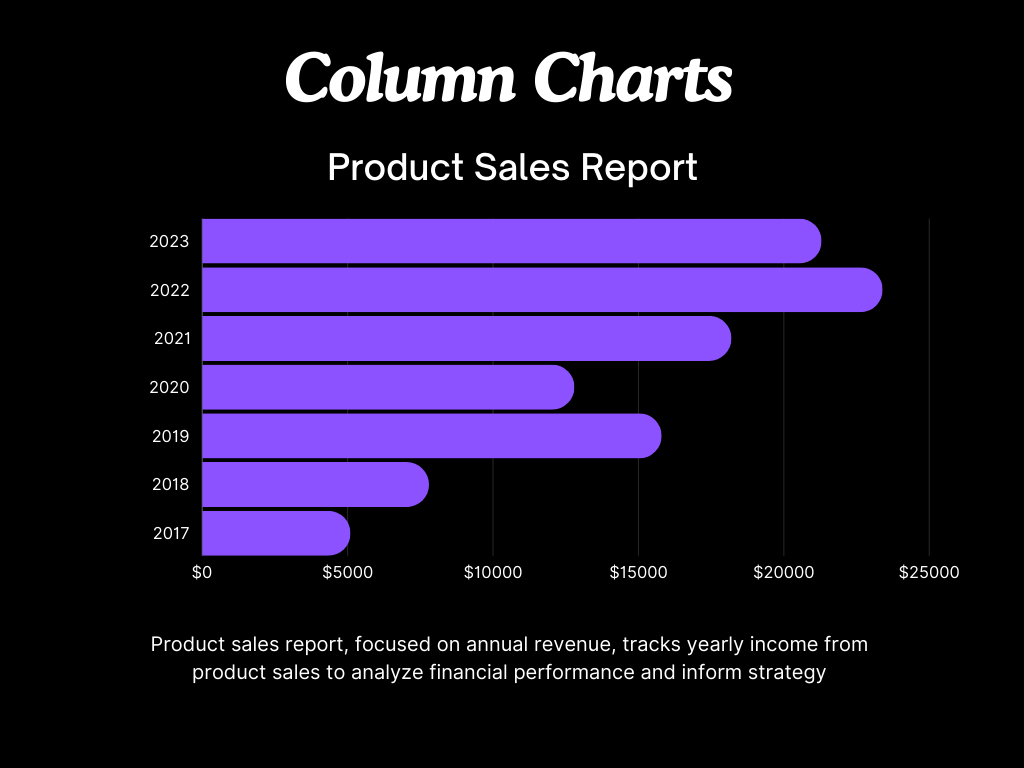
- Purpose: Similar to bar charts but with vertical bars.
- Structure: Vertical bars.
- Use Cases: Monthly sales data comparison, comparing product performance.
- Advantages: Effective for chronological data.
Line and Area Charts
Line Charts:
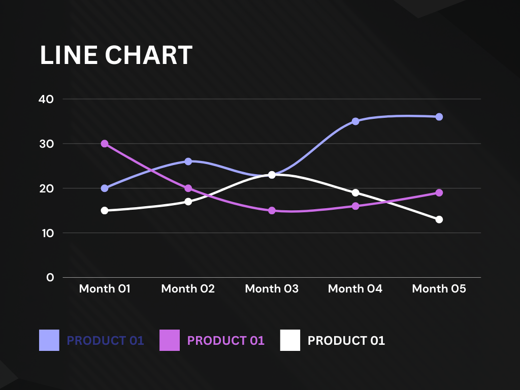
- Purpose: Show trends over time.
- Structure: Data points connected by lines.
- Use Cases: Stock prices, website traffic trends.
- Advantages: Clearly shows trends, fluctuations, and data points over time.
Area Charts:
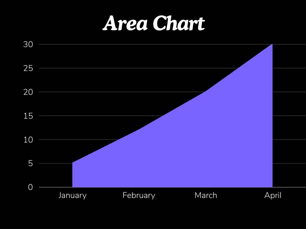
- Purpose: Similar to line charts but with the area under the line filled.
- Structure: Filled area under the line.
- Use Cases: Cumulative data trends, revenue over time.
- Advantages: Emphasizes the volume of change and helps in comparing multiple variables.
Stacked Area Charts:
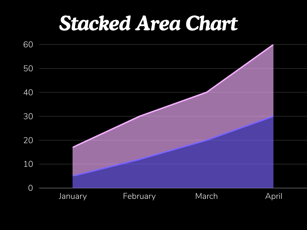
- Purpose: Show cumulative totals over time.
- Structure: Multiple areas stacked on top of each other.
- Use Cases: Showing the total revenue by product category over time.
- Advantages: Visualizes the contribution of each category to the total.
Pie and Donut Charts
Pie Charts:
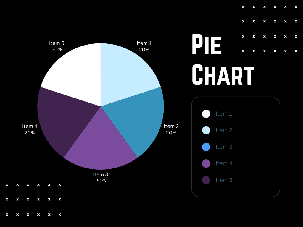
- Purpose: Show parts of a whole.
- Structure: Circular chart divided into sectors.
- Use Cases: Market share, budget allocation.
- Advantages: Simple and easy to understand.
Donut Charts:
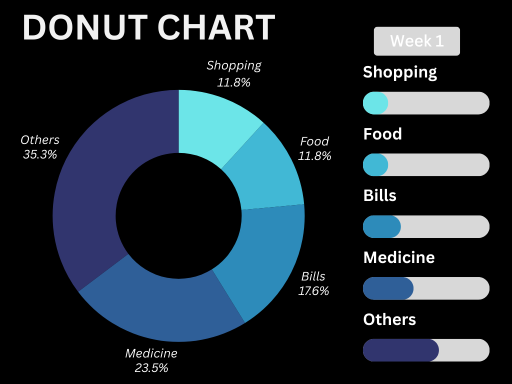
- Purpose: Similar to pie charts but with a central hole.
- Structure: Circular chart with a central blank space.
- Use Cases: Similar to pie charts, often used for aesthetic reasons.
- Advantages: Central space can be used for additional information.
Scatter and Bubble Charts
Scatter Charts:
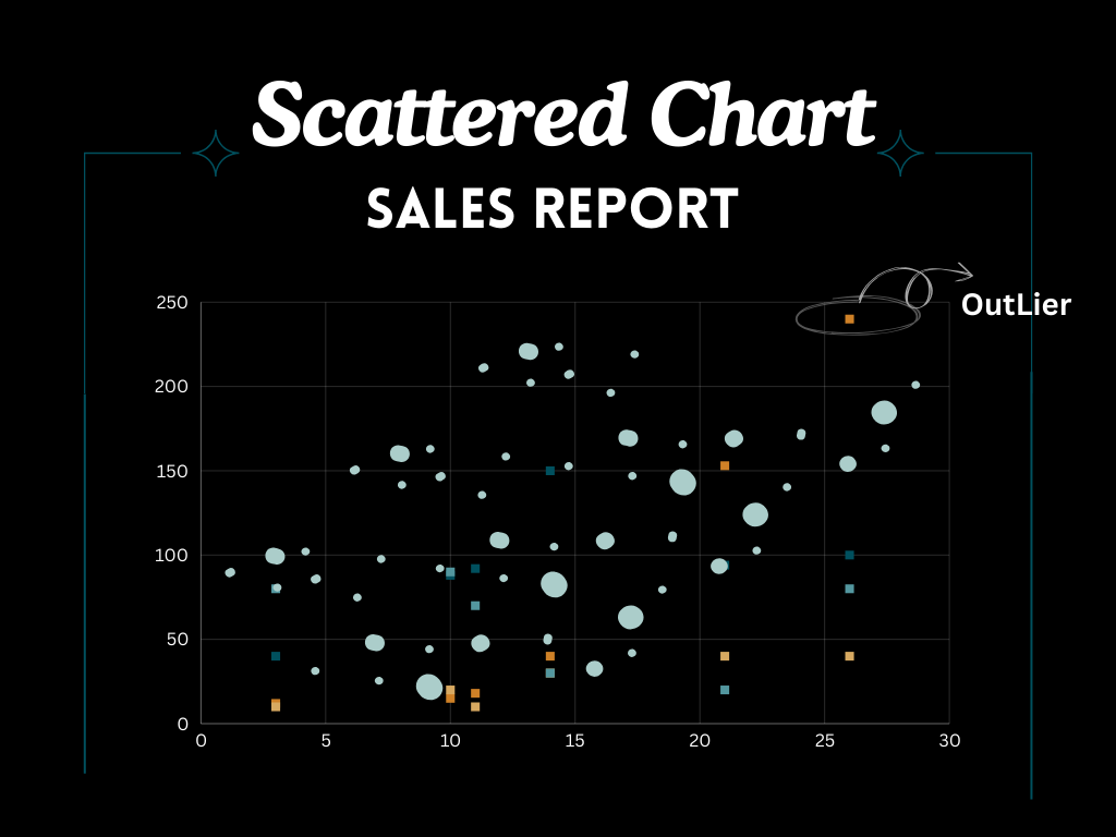
- Purpose: Show relationships between two variables.
- Structure: Data points plotted on a two-dimensional graph.
- Use Cases: Correlation between advertising spend and sales.
- Advantages: Good for displaying and identifying trends, patterns, and outliers.
Bubble Charts:
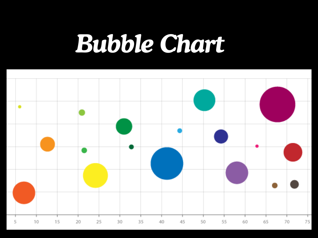
- Purpose: Similar to scatter charts but with an additional dimension.
- Structure: Bubbles of varying sizes.
- Use Cases: Visualizing data with three variables, such as population, GDP, and life expectancy.
- Advantages: Adds a third variable to the comparison.
Treemaps
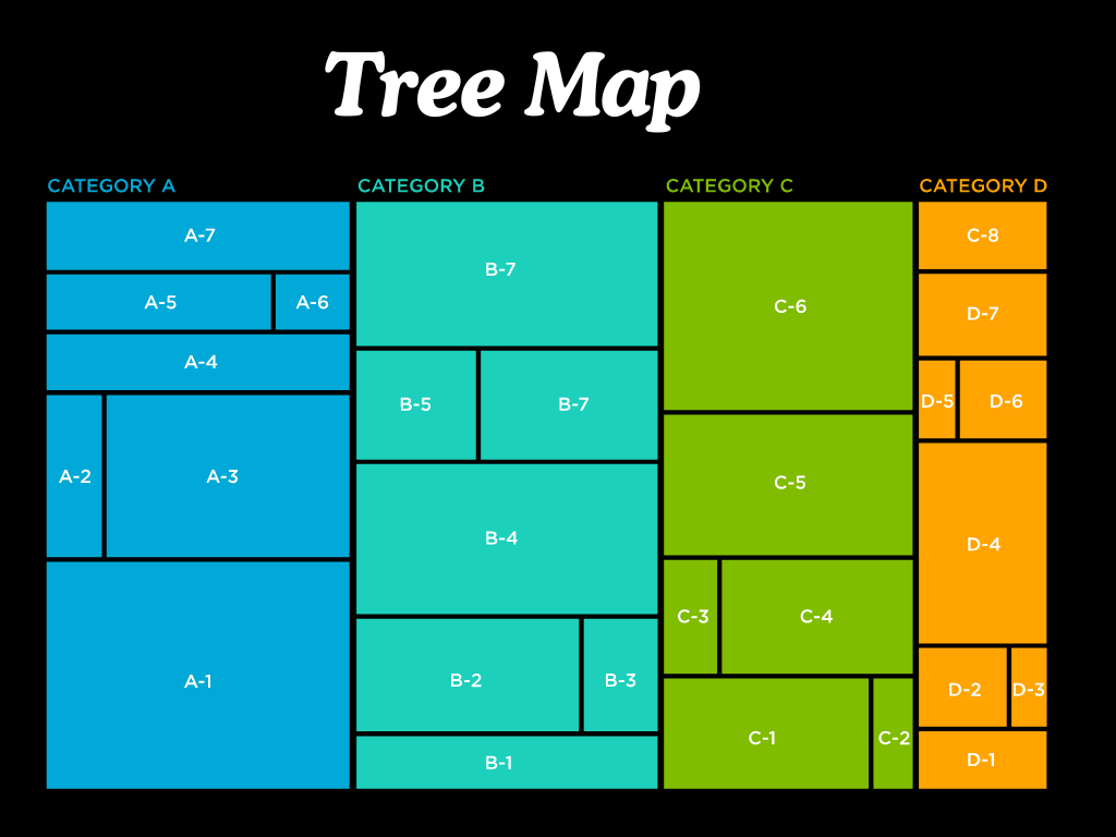
- Purpose: Visualize hierarchical data.
- Structure: Nested rectangles.
- Use Cases: Storage space usage, sales by region and category.
- Advantages: Efficiently uses space to show large amounts of data and their hierarchical relationships.
Maps
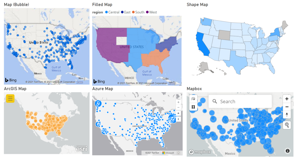
Maps:
- Purpose: Display data across geographical regions.
- Structure: Geographical regions with data overlaid.
- Use Cases: Population density, sales by region.
- Advantages: Provides clear geographical context and spatial relationships.
Filled Maps:
- Purpose: Show data distribution across geographical regions.
- Structure: Regions filled with colors representing data values.
- Use Cases: Election results, sales distribution.
- Advantages: Visualizes data intensity across regions.
Shape Maps:
- Purpose: Display relative comparisons across regions.
- Structure: Custom shapes filled with data values.
- Use Cases: Custom geographical regions, sales territories.
- Advantages: Allows custom regional boundaries for more specific analysis.
Waterfall Charts
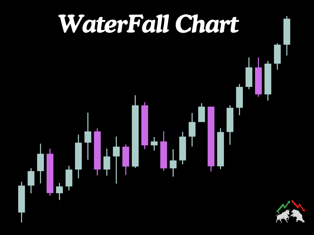
- Purpose: Show the cumulative effect of sequential positive and negative values.
- Structure: Bars representing increases and decreases.
- Use Cases: Profit and loss statements, inventory levels over time.
- Advantages: Clearly shows the contribution of individual elements to the total change.
Funnel Charts
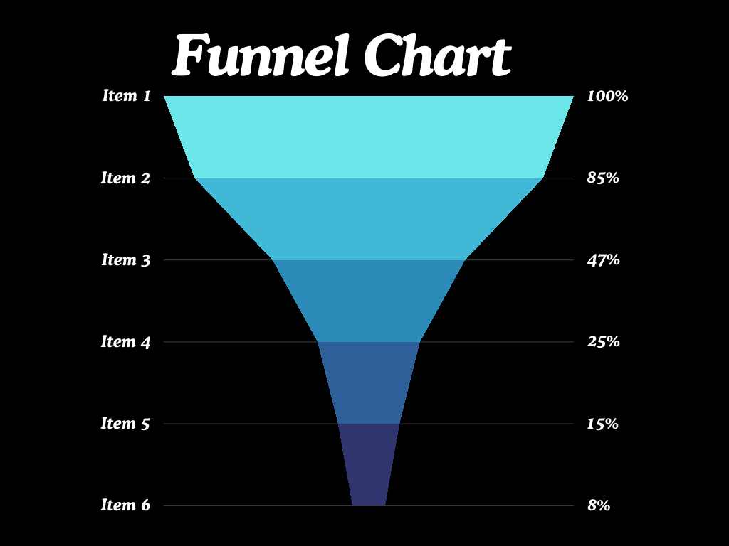
- Purpose: Show stages in a process.
- Structure: A funnel shape with segments representing stages.
- Use Cases: Sales pipeline, customer journey.
- Advantages: Highlights drop-offs between stages.
Gauge Charts
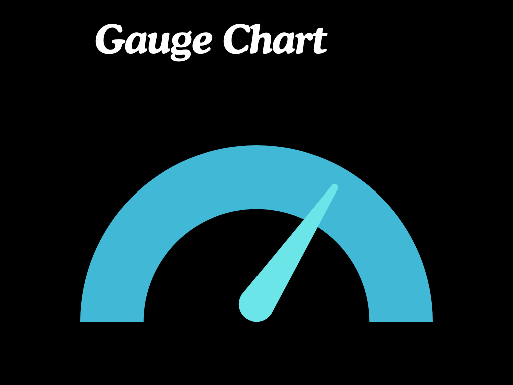
- Purpose: Show progress towards a goal.
- Structure: A circular gauge with a needle.
- Use Cases: KPIs, performance metrics.
- Advantages: Visually intuitive for showing progress.
KPI Visuals
- Purpose: Display key performance indicators.
- Structure: Numeric value with indicators.
- Use Cases: Sales targets, performance metrics.
- Advantages: Quickly conveys key metrics and goals.
Combo Charts
- Purpose: Combine two types of charts.
- Structure: Typically combines column and line charts.
- Use Cases: Revenue and profit margins over time.
- Advantages: Shows multiple data series in a single visualization.
Slicers

- Purpose: Filter data on the report.
- Structure: Interactive buttons or dropdowns.
- Use Cases: Filtering sales data by region or product.
- Advantages: Enhances interactivity and data exploration.
Matrix and Table Visuals
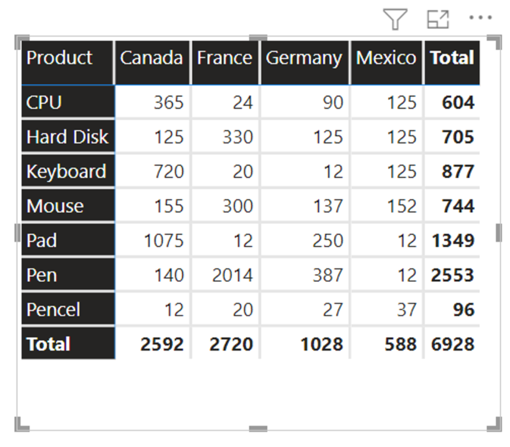
- Purpose: Display data in a pivot-table format.
- Structure: Rows and columns with data values.
- Use Cases: Summarizing sales by region and product.
- Advantages: Provides detailed and hierarchical data analysis.
Table Visuals:
- Purpose: Display data in a tabular format.
- Structure: Rows and columns.
- Use Cases: Detailed data listings, transaction records.
- Advantages: Simple and straightforward for detailed data.
Decomposition Tree
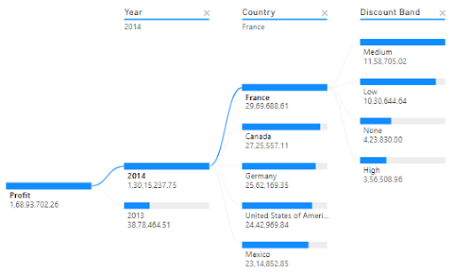
- Purpose: Analyze data by breaking it down into multiple dimensions.
- Structure: Hierarchical tree structure.
- Use Cases: Analyzing the root cause of an issue.
- Advantages: Interactive and allows deep dive into data breakdowns.
Key Influencers
- Purpose: Identify key factors influencing a particular metric.
- Structure: Visual representation of factors and their impacts.
- Use Cases: Understanding factors affecting sales performance.
- Advantages: Provides insights into what drives key metrics.
Why Specific Charts Are Used
Choosing the right chart type depends on the nature of your data and the insights you want to extract. Here are some considerations:
- Comparison: Use bar and column charts to compare data across categories.
- Trends Over Time: Line and area charts are ideal for showing trends and patterns over time.
- Proportions: Pie and donut charts effectively display parts of a whole.
- Relationships: Scatter and bubble charts are great for identifying correlations between variables.
- Hierarchical Data: Treemaps are useful for visualizing hierarchical data structures.
- Geographical Data: Maps are the best choice for displaying data across different geographical regions.
Creating a Basic Dashboard in Power BI
What is Power BI ?
dashboard in Power BI is a collection of visualizations that provide a comprehensive view of your data. Creating a dashboard involves several steps, from importing data to customizing visualizations.
Steps to Create a Basic Dashboard:
- Import Data:
- Get Data: Open Power BI Desktop, click on “Get Data,” and select your data source (e.g., Excel, SQL Server).
- Load Data: Connect to your data source, preview the data, and click “Load” to import it into Power BI.
- Create Visualizations:
- Select Fields: Drag and drop fields from the Fields pane onto the Report Canvas.
- Choose Visualization Type: Select the desired chart type from the Visualizations pane.
- Customize Visualizations: Use the formatting options to customize the appearance and behavior of your charts.
- Add Interactivity:
- Slicers: Add slicers to your report to enable users to filter data interactively.
- Drill-Through: Enable drill-through to allow users to navigate to detailed reports from summary visualizations.
- Arrange Visualizations:
- Layout: Organize your visualizations on the Report Canvas to create a logical and visually appealing layout.
- Titles and Labels: Add titles and labels to your visualizations for clarity.
- Create the Dashboard:
- Publish Report: Publish your report to the Power BI service.
- Pin Visualizations: Pin visualizations from your report to a new dashboard.
- Customize Dashboard: Arrange the pinned tiles on the dashboard, add text boxes, images, and other elements as needed.
- Share Dashboard:
- Share: Click on the “Share” button in the Power BI service to share your dashboard with colleagues or stakeholders.
- Adjust Permissions: Control who can view or edit the dashboard by setting appropriate permissions.
Key Functions for Creating Dashboards
- Filters: Apply filters to control the data displayed in your visualizations.
- Slicers: Interactive controls that allow users to filter data dynamically.
- Drill-Through: Enable users to navigate to detailed reports from summary visualizations.
- Conditional Formatting: Highlight important data points or trends using color and formatting rules.
- Bookmarks: Save and share specific views of your report for easy access.
- Tooltips: Provide additional context by displaying detailed information when users hover over data points.
- Grouping and Binning: Group data into categories or bins for better analysis.
- Custom Visuals: Import and use custom visuals created by the Power BI community.
Conclusion
Power BI’s diverse range of chart types and customization options make it a powerful tool for data visualization. By understanding the different chart types and their applications, you can create insightful visualizations that effectively communicate your data. Building a basic dashboard in Power BI involves importing data, creating and customizing visualizations, and arranging them into a cohesive and interactive layout. With Power BI, you can transform raw data into actionable insights, making your data analysis more impactful and accessible.
Frequently Asked Questions
Consider the nature of your data and the insights you want to extract. Use bar charts for comparisons, line charts for trends, pie charts for proportions, and scatter charts for relationships.
Yes, you can import custom visuals from the Power BI marketplace or create your own using the Power BI Developer Tools.
Use data connections that support real-time updates or schedule refreshes in the Power BI service to keep your dashboard data current.