Introduction
Applying CSS in button are interactive elements that users can click or tap to perform an action, such as submitting a form or navigating to another page.
Features
- Styling: CSS allows developers to style buttons extensively, including properties like background color, text color, border, padding, and font properties.
- Hover Effects: Hover effects can be applied to buttons using CSS to provide visual feedback when users hover their mouse cursor over the button. This can include changing the background color, text color, or adding a shadow effect.
- Transitions: CSS transitions can be used to add smooth animations to button states, such as when the button is hovered over or clicked. This enhances the user experience by providing subtle visual cues.
- Pseudo-classes: CSS pseudo-classes such as
:hover,:active, and:focuscan be used to apply different styles to buttons based on their current state, making them more interactive and engaging.
By leveraging CSS, developers can create stylish and interactive buttons that enhance the usability and visual appeal of web applications.
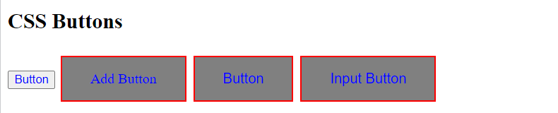
Button Styling
.button {
  background-color: gray;
  border: 2px solid red;
  color: Blue;
  padding: 15px 32px;
  text-align: center;
  text-decoration: none;
  display: inline-block;
  font-size: 16px;
  margin: 6px 2px;
  cursor: pointer;
}output
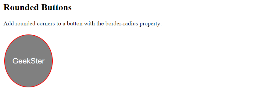
Rounded Buttons
.button {
  background-color: gray; /* Green */
  border: 2px solid red;
  color: white;
  height:140px;
  padding: 20px;
  text-align: center;
  text-decoration: none;
  display: inline-block;
  font-size: 20px;
  margin: 4px 2px;
  cursor: pointer;
  border-radius: 50%;
}output
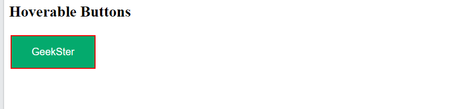
Hoverable Buttons
.button {
  border: none;
  color: white;
  padding: 16px 32px;
  text-align: center;
  text-decoration: none;
  display: inline-block;
  font-size: 16px;
  margin: 4px 2px;
  transition-duration: 0.4s;
  cursor: pointer;
}

.button1 {
  background-color: gray;
  color: black;
  border: 2px solid red;
}

.button1:hover {
  background-color: #04AA6D;
  color: white;
}Output
Disabled Buttons:
.button {
  cursor: not-allowed;
}This CSS snippet sets the cursor property to “not-allowed” for elements with the class “button”. When users hover over these elements, the cursor will change to a “no parking sign”, indicating that the button is disabled or cannot be interacted with.
Conclusion
Applying CSS in button are essential components of web design that provide users with a means to interact with web pages. By leveraging CSS styling and interactive features, developers can create buttons that not only enhance the visual appeal of a website but also improve the user experience. From customizing the appearance of buttons to adding hover effects and transitions, CSS offers a versatile toolkit for creating buttons that are both stylish and functional. With careful design and attention to user interaction, CSS buttons can play a significant role in creating engaging and user-friendly web applications.
Frequently Asked Questions
CSS buttons are interactive elements in web design that users can click or tap to perform an action, such as submitting a form or navigating to another page. They are styled using CSS to match the design aesthetic of a website or application.
CSS provides a wide range of styling options for buttons, including properties like background color, text color, border, padding, font properties, and more. Developers can customize these properties to create buttons that match their design requirements.
CSS allows developers to add interactive features to buttons using pseudo-classes like :hover, :active, and :focus. These pseudo-classes enable developers to apply different styles to buttons based on user interactions, enhancing the user experience.
