Introduction
Animations In CSS allows developers to create motion and transition effects on HTML elements without the need for JavaScript or external libraries. Here’s a summary of key points regarding CSS animation:
- Keyframes:
- CSS animation is based on keyframes, which define the style changes that occur at specific points during the animation’s duration. Keyframes are defined using the
@keyframesrule, specifying the percentage of the animation duration at which each style change occurs.
- CSS animation is based on keyframes, which define the style changes that occur at specific points during the animation’s duration. Keyframes are defined using the
- Animation Properties:
- CSS animation properties such as
animation-name,animation-duration,animation-timing-function,animation-delay,animation-iteration-count, andanimation-directioncontrol various aspects of the animation’s behavior, including its duration, timing, delay, repetition, and direction.
- CSS animation properties such as
- Transition Effects:
- CSS animations can create a variety of transition effects, including movement (translation), rotation, scaling, fading (opacity), and color changes. By specifying different keyframes and animation properties, developers can create complex motion effects and dynamic visual experiences.
- Triggering Animations:
- Animations can be triggered using CSS pseudo-classes like
:hover,:focus,:active, or by adding/removing classes with JavaScript. This allows for interactive animations that respond to user interactions or events.
- Animations can be triggered using CSS pseudo-classes like
Examples on CSS Animations
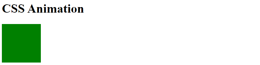
The @keyframes Rule on CSS Animations
When you specify CSS styles inside the @keyframes rule, the animation will gradually change from the current style to the new style at certain times.
div {
  width: 100px;
  height: 100px;
  background-color: green;
  animation-name: example;
  animation-duration: 4s;
}

@keyframes example {
    0% { transform: translateX(-100%); }
    100% { transform: translateX(0); }
}output
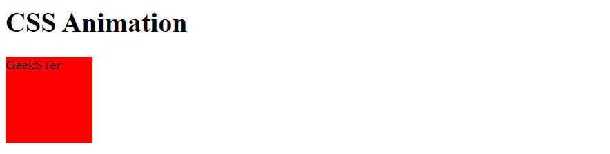
The following example will change both the background-color and the position of the <div> element when the animation is 25% complete, 50% complete, and again when the animation is 100% complete:
@keyframes example {
  0%   {background-color:red; left:0px; top:0px;}
  25%  {background-color:yellow; left:200px; top:0px;}
  50%  {background-color:blue; left:200px; top:200px;}
  75%  {background-color:green; left:0px; top:200px;}
  100% {background-color:red; left:0px; top:0px;}
}Output
Delay an Animation
The animation-delay property specifies a delay for the start of an animation.
div {
  width: 100px;
  height: 100px;
  background-color: red;
  position: relative;
  animation-name: example;
  animation-duration: 4s;
  animation-delay: 2s;
}

@keyframes example {
  0%   {background-color:red; left:0px; top:0px;}
  25%  {background-color:yellow; left:200px; top:0px;}
  50%  {background-color:blue; left:200px; top:200px;}
  75%  {background-color:green; left:0px; top:200px;}
  100% {background-color:red; left:0px; top:0px;}
}output
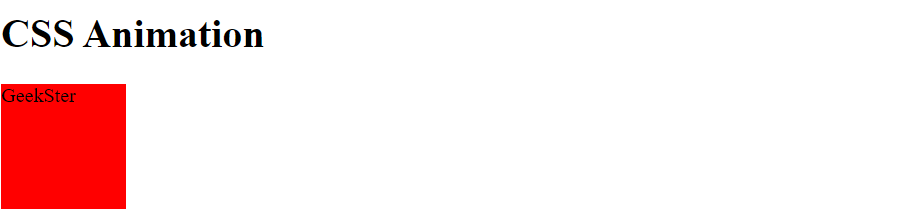
Negative values are also allowed. If using negative values, the animation will start as if it had already been playing for N seconds.
Set How Many Times an Animation Should Run
The animation-iteration-count property specifies the number of times an animation should run.
.elemenat{
  width: 50px;
  height: 50px;
  position: relative;
	background-color: green;
  animation-name: example;
  animation-duration: 4s;
  animation-iteration-count: 4;
}value “infinite” to make the animation continue for ever:
Animation in Reverse Direction or Alternate Cycles
The animation-direction property specifies whether an animation should be played forwards, backwards or in alternate cycles.
div {
  width: 200px;
  height: 200px;
  position: relative;
  background-color: green;
  animation-name: example;
  animation-duration: 5s;
  animation-direction: reverse;
}The Speed Curve of the Animation
The animation-timing-function property specifies the speed curve of the animation.
#ele1 {animation-timing-function: linear;}
#ele2 {animation-timing-function: ease;}
#ele3 {animation-timing-function: ease-in;}
#ele4 {animation-timing-function: ease-out;}
#ele5 {animation-timing-function: ease-in-out;}The same animation effect as above can be achieved by using the shorthand animation property:
.elemant {
  animation: example 4s linear 3s infinite alternate;
}Conclusion
CSS animation provides developers with a powerful tool to create dynamic and visually appealing effects in web design. By leveraging keyframes and animation properties, developers can bring web pages to life with smooth transitions, interactive motion effects, and engaging user experiences. While CSS animations offer flexibility and creativity in design, it’s important to consider performance optimization and browser compatibility to ensure a seamless experience across different devices and platforms. With careful planning and implementation, CSS animations can significantly enhance the aesthetics and usability of web interfaces, making them more engaging and memorable for users.
Frequently Asked Questions on CSS Animations
Yes, CSS animations can be used to create a wide range of motion effects, including movement (translation), rotation, scaling, fading (opacity), and color changes. By combining keyframes and animation properties, developers can create complex and dynamic animations that enhance user experience.
CSS animations are supported in most modern browsers, including Google Chrome, Mozilla Firefox, Safari, and Microsoft Edge. However, it’s essential to check compatibility with older browsers and consider fallback options or polyfills if necessary.
To optimize performance, developers should minimize the number of complex animations applied to elements, especially on mobile devices. Additionally, using hardware-accelerated rendering techniques and optimizing animation properties can improve rendering performance.
