
Introduction
CSS gradients are a powerful feature that allows developers to create smooth transitions between two or more colors. We can apply gradients to backgrounds, borders, text, and other CSS properties, adding depth and visual interest to elements.
Key points about CSS Gradients
- Types of Gradients:
- CSS supports two main types of gradients: linear gradients and radial gradients. Linear gradients create a smooth transition between two or more colors along a straight line, whereas radial gradients create a transition radiating from a center point outward.
- Gradient Direction:
- For linear gradients, developers can specify the direction of the gradient using angles (e.g., 90deg for a vertical gradient, 45deg for a diagonal gradient).
- Color Stops:
- Gradients consist of color stops, which define the colors and positions along the gradient line or radial gradient. Developers can specify multiple color stops to create complex gradient effects with smooth transitions between colors.
- Color Formats:
- CSS gradients support various color formats, including color keywords, hexadecimal notation, RGB, RGBA, HSL, HSLA, and even other gradients. This flexibility allows developers to create gradients that match their design requirements.
CSS defines three types of gradients:
- Linear Gradients (goes down/up/left/right/diagonally)
- Radial Gradients (defined by their center)
- Conic Gradients (rotated around a center point)
CSS Linear Gradients
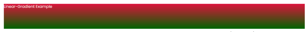
Linear gradients are quite easy to use. For the most elementary gradient it is enough to set the start and end colors, such as:
.element{
	background: linear-gradient(crimson, darkgreen);
}
You can set the direction using degrees or keywords.
Degrees:
From 0 to 360, for example 270deg.
Keywords:
- to top = 0deg;
- to right = 90deg;
- to bottom = 180deg – default value;
- to left = 270deg.
Keywords can be combined with each other to get a diagonal gradient, for example to top left.
Below you can see how different directions work in stretching from crimson to darkgreen:
	.top {
		background: linear-gradient(to top, crimson, darkgreen);
	}
	.right {
		background: linear-gradient(to right, crimson, darkgreen);
	}
	.bottom {
		background: linear-gradient(to bottom, crimson, darkgreen);
	}
	.left {
		background: linear-gradient(to left, crimson, darkgreen);
	}
	.top-left {
		background: linear-gradient(to top left, crimson, darkgreen);
	}
	.top-right {
		background: linear-gradient(to top right, crimson, darkgreen);
}output
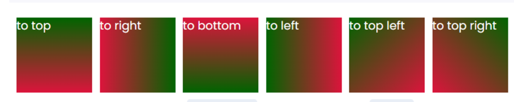
It should be remembered that to top right is not the same as 45deg. The gradient colors are located perpendicular to the gradient direction line. When using “to top right,” the line extends from the lower left to the upper right corner. With “45deg,” it strictly maintains this angle, regardless of the shape’s size.
We can also set stop points for gradient colors; values are specified in units or percent and can be more than 100% and less than 0%.
Examples of setting values in %, em and values that go beyond the boundaries of an element are:
.percent {
	background: linear-gradient(to right, yellowgreen 15%, gold 25%);
}
.ems {
	background: linear-gradient(to right, purple 2em, crimson 3em, orangered 7em, gold 12em);
}
.negative {
	background: linear-gradient(to right, skyblue -50%, purple 150%);
}output

CSS Radial Gradients:
Radial gradients in CSS create smooth transitions between colors that radiate outward from a central point. They offer flexibility in creating visually appealing background effects for elements
Brief explanation of CSS radial gradients
- Definition:
- Radial gradients are defined by their center, where the transition between colors originates. They allow developers to specify a central point from which colors radiate outward in a circular or elliptical pattern.
- Syntax:
- The syntax for defining a radial gradient includes the
radial-gradient()function, followed by parameters such as the shape, size, position, and color stops. At least two color stops are required to define the gradient’s colors.
- The syntax for defining a radial gradient includes the
- Parameters:
- The
shapeparameter determines the shape of the gradient (default isellipse). Thesizeparameter specifies the size of the gradient (default isfarthest-corner). Thepositionparameter defines the central point of the gradient (default iscenter).
- The
- Color Stops:
- Color stops define the colors and their positions along the gradient. Developers can specify multiple color stops to create complex radial gradients with smooth transitions between colors.
.element{
  height: 150px;
  width: 200px;
  background-image: radial-gradient(circle, #ff0000, #00ff00);
}Output

If the shape is not specified, but the size is specified, one value sets the radius of the circle; if there are two values, the gradient takes the form of an ellipse. If there are sizes, explicitly setting the gradient shape is ignored.
The position determines where the center of the gradient will be located . They use the same keywords as the linear gradient, but with the prefix at: at top, at right, aat bottom, at left and at center – the default value.
It can be combined to arrange the gradient on a given side, for example, positioning it at the upper right corner by using “right top”.
.top {
	background: radial-gradient(at top, crimson, darkgreen);
}
.right {
	background: radial-gradient(at right, crimson, darkgreen);
}
.bottom {
	background: radial-gradient(at bottom, crimson, darkgreen);
}
.left {
	background: radial-gradient(at left, crimson, darkgreen);
}
.center {
	background: radial-gradient(at center, crimson, darkgreen);
}
.top-left {
	background: radial-gradient(at top left, crimson, darkgreen);
}
.top-right {
	background: radial-gradient(at top right, crimson, darkgreen);
}Output

The shape (the final gradient shape) can be a circle or an ellipse. By default, it is an ellipse. the gradient tends to take up all the free space of the element, stretching out if necessary.
In order for the gradient to have a circle shape, this must be set explicitly using the keyword circle.
.circle {
	background: radial-gradient(circle, crimson 50%, darkgreen 70%);
}Output

CSS Conical Gradients
Conical gradients in CSS, also known as conic gradients, create a gradient effect that radiates from the center of a circle, sweeping around the center like the hands of a clock. They are useful for creating pie charts, color wheels, and other circular designs.
Syntax
background: conic-gradient([from angle] [at position,] color-stop1, color-stop2, ...);- from angle (optional): Specifies the starting angle of the gradient. By default, the gradient starts at 0 degrees (top).
- at position (optional): Specifies the center position of the gradient. By default, it’s at the center (
centeror50% 50%). - color-stop: Specifies the color and position in the gradient. Positions are defined as percentages or angles.
Example:-
div {
  width: 200px;
  height: 200px;
  background: conic-gradient(red, yellow, green, cyan, blue, magenta, red);
}Output:-

Conclusion
It gradients offer a versatile and visually appealing way to create smooth transitions between colors in web design. By defining the shape, size, position, and color stops, developers can achieve a wide range of gradient effects to enhance the aesthetics of websites and applications. Designers use gradients for backgrounds, borders, text, and other elements, providing them with a powerful tool to create modern and stylish designs. With widespread browser support and flexible customization options, CSS gradients have become an essential feature in web development, allowing developers to create engaging and dynamic user experiences.
Frequently Asked Question
We can apply CSS gradients to various CSS properties, including background-image, border-image, text-fill-color, and even mask-image. This allows developers to create gradient effects for backgrounds, borders, text, and more.
Modern web browsers widely support gradients, including Chrome, Firefox, Safari, and Edge. However, for optimal performance, it’s imperative to assess compatibility in older browsers and incorporate fallback options. This guarantees seamless user experience and enhances SEO rankings. It ensures graceful degradation.
Yes, it support multiple color stops and various parameters such as shape, size, and position. Developers can create complex gradient effects with smooth transitions between colors by specifying multiple color stops and adjusting gradient parameters.
