Introduction
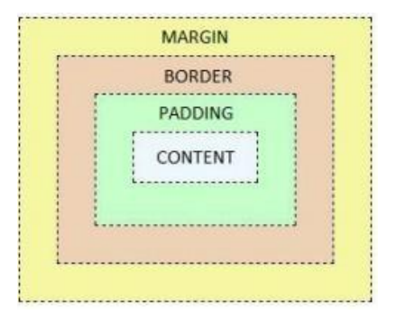
The CSS Box Model conceptualizes every HTML element as a rectangular box. This box consists of four main parts:
- Content: The actual content of the element, such as text, images, or other media.
- Padding: The space between the content and the element’s border. It’s controlled by the
paddingproperty in CSS. - Border: A border surrounding the padding (and content). It’s defined using the
borderproperty and its related properties (border-width,border-style,border-color). - Margin: The space between the border of the element and surrounding elements. It’s controlled by the
marginproperty.
The CSS Box Model is a fundamental concept that describes the layout and design of elements in a web page. It defines how elements are rendered visually, including their dimensions, padding, borders, and margins. The Box Model is comprised of several components:
1.Content Area
The innermost part of the box represents the actual content of the element, such as text, images, or other media.
2.Padding
Padding is the space between the content area and the element’s border. It provides additional space inside the box, helping to separate the content from the border.
3.Border
The border surrounds the padding and content area, defining the outer edge of the box. Borders can be styled with different colors, widths, and styles to create visual effects.
4.Margin
Margins are the space outside the border, which determines the distance between the element and its neighboring elements. Margins help control the layout and spacing between elements on the page.
The CSS Box Model provides a structured approach to designing layouts, allowing developers to control the size, spacing, and appearance of elements with precision. By understanding and manipulating the properties of the Box Model, designers can create visually appealing and well-organized web pages that adapt to various screen sizes and devices.
The CSS Box Model Module, a part of the CSS specifications, provides detailed rules and guidelines for implementing the Box Model in web layouts. It defines properties such as width, height, padding, border, and margin, along with their respective values and behaviors.
Key concepts covered in the CSS Box Model Module include:
Box Sizing
Defines how the total width and height of an element are calculated, taking into account the content, padding, border, and margin.
Padding Properties:
Allows developers to specify padding values for individual sides of the element (e.g., padding-top, padding-right, padding-bottom, padding-left).
Border Properties
Provides properties for customizing the border of an element, including color, width, and style (e.g., border-color, border-width, border-style).
Margin Properties
Defines properties for setting margins around elements to control spacing between them (e.g., margin-top, margin-right, margin-bottom, margin-left).
Box Model Rendering
Describes how the Box Model is rendered by browsers, including how padding, border, and margin affect the overall layout of elements on the page.
The image below illustrates the box model:

Box-Sizing
The box-sizing property defines how the width and height get applied on an element.
It can be useful to play with box-sizing.
E.g. An element needs to take a precise amount of space on a page, with its padding and border included.
It can take two possible values:
Content-Box
The width and height of the element include only the content.i.e the border, padding and margin are not part of the width or height.
This is the default value.
Border-Box
The width and height of the element include content, padding and border.

div{
	width: 300px;
  height: 200px;
  padding: 15px;
  border: 5px solid gray;
  margin: 30;
  box-sizing:border-box;
}div{
width: 300px;
height: 200px;
padding: 15px;
border: 5px solid gray;
margin: 30;
box-sizing:content-box;
}Conclusion
The CSS Box Model is a foundational concept in web design, providing a structured approach to layout and design. By understanding the Box Model and its components, designers can create visually appealing and well-structured web layouts that adapt to different screen sizes and devices.
Key takeaways from the CSS Box Model include:
- Understanding the four main components: content area, padding, border, and margin.
- Manipulating properties such as
width,height,padding,border, andmarginto control layout and spacing. - Using the
box-sizingproperty to adjust how the total width and height of an element are calculated. - Applying best practices for designing responsive and accessible web layouts.
Frequently Asked Questions
The CSS Box Model is a fundamental concept in web design that describes the layout and rendering of elements on a web page. It consists of four main components: content area, padding, border, and margin.
The Box Model determines the size, spacing, and appearance of elements on a web page. By understanding and manipulating the properties of the Box Model, designers can create visually appealing layouts with precise control over dimensions and spacing.
Padding: Space between the content area and the border of an element.
Border: A line that surrounds the padding and content area, defining the outer edge of the element.
Margin: Space outside the border, determining the distance between the element and its neighboring elements.
You can adjust the size of an element by setting its width and height properties. The total width and height of the element are calculated based on the content area, padding, border, and margin.

